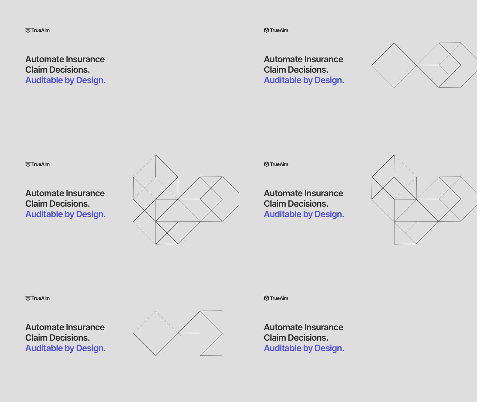
Brand identity direction
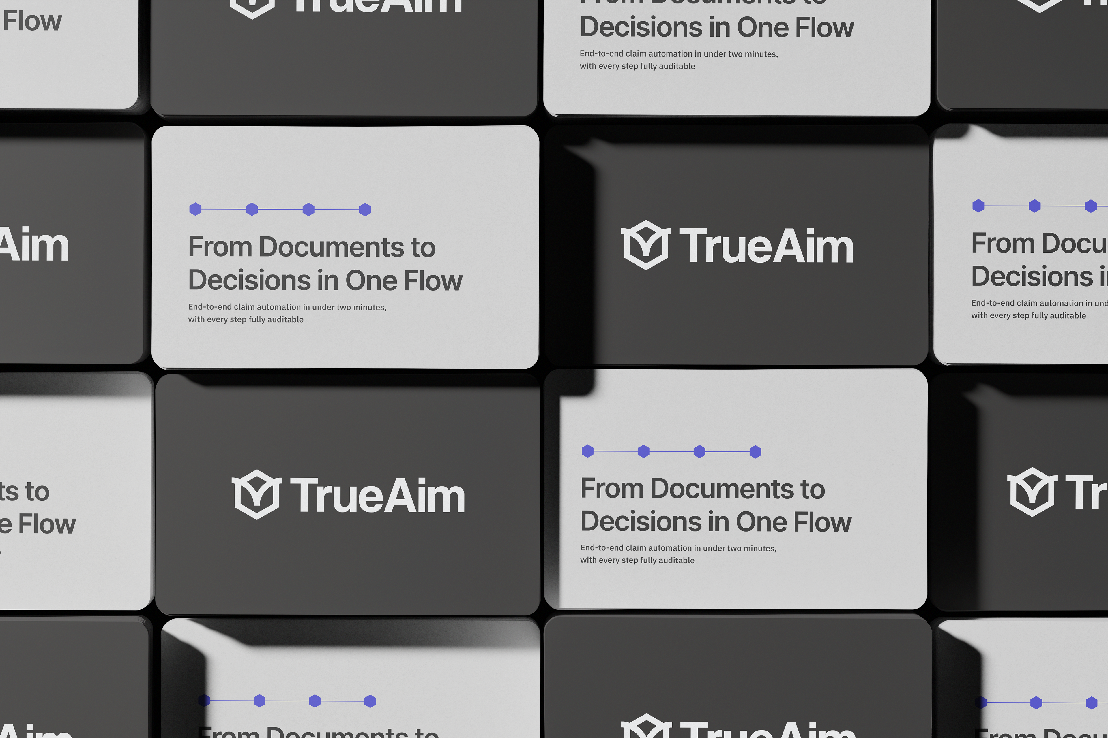
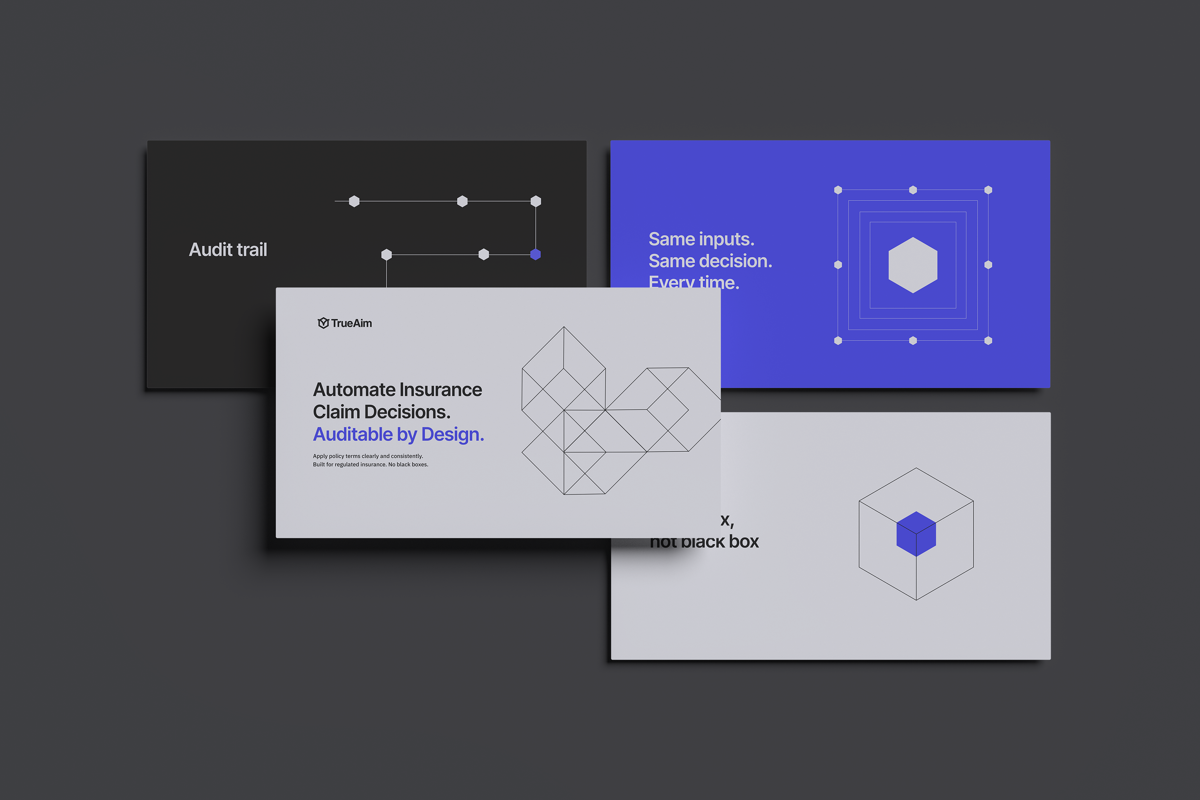
The visual language is clean, modular and intelligent.
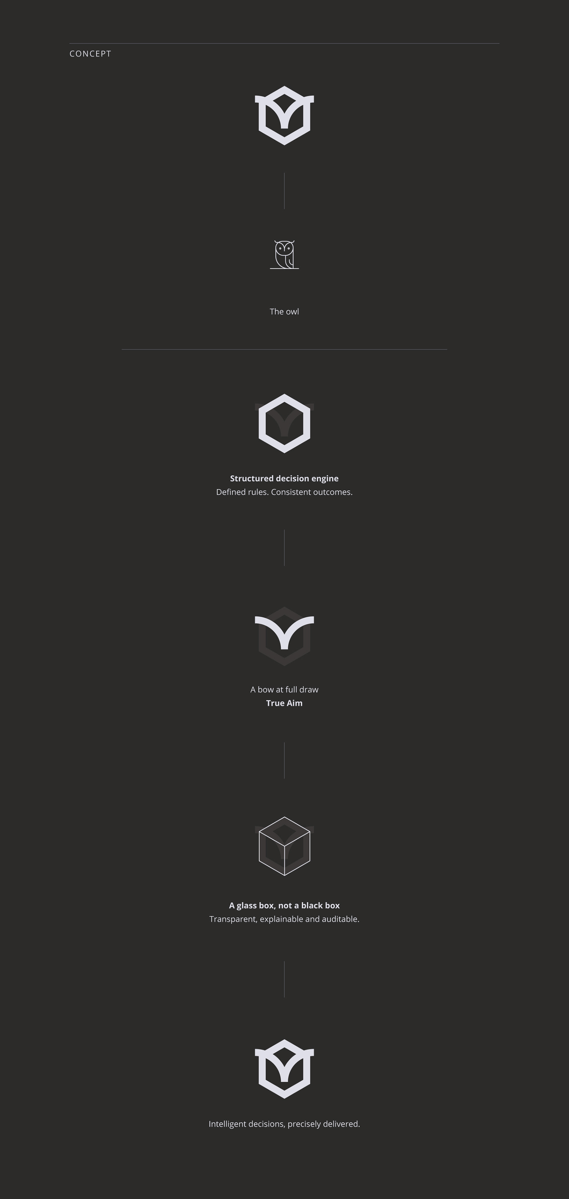
It grows directly from the geometry of the logo.
The box is the core unit. Lines create movement and show the structure. It is always clear and geometric, but each composition represents an actual idea or process.
The elements can expand, connect, separate and rebuild to show different processes. I can see a lot of ways to expand this language, so it doesn’t feel stiff. But it still feels solid.
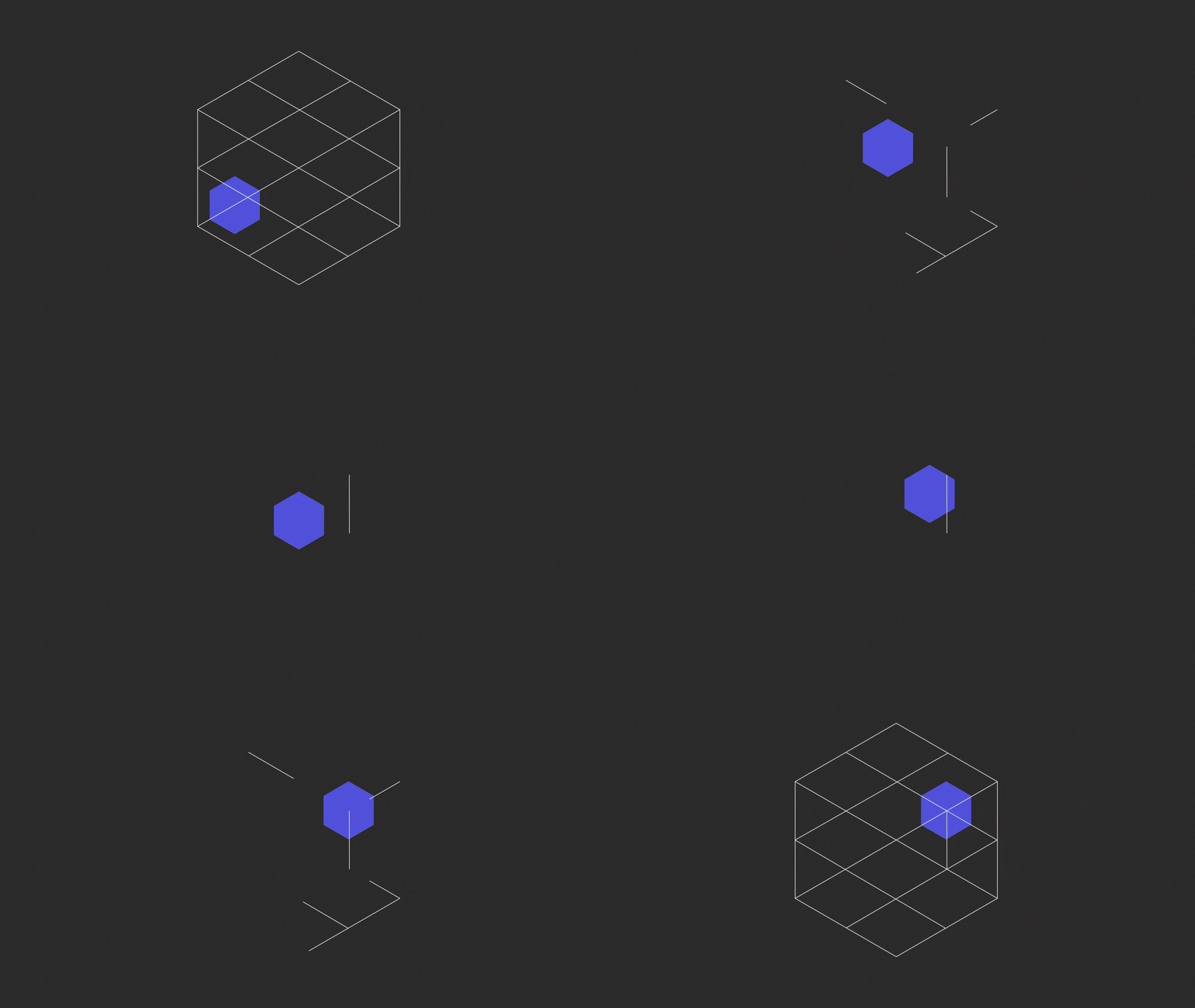
This is example of how I imagine working with this language:
here the blue box represents a claim moving through the system. The view narrows from the full case structure to the specific policy rule that determines the outcome (a line). The flash marks the decision, after which the full structure returns to show that the result remains connected to its complete logic and audit trail.
So, it's "We solve the hardest part of claims: the decision itself".
Also overall it's a glass box, not a black box.
So, it's "We solve the hardest part of claims: the decision itself".
Also overall it's a glass box, not a black box.
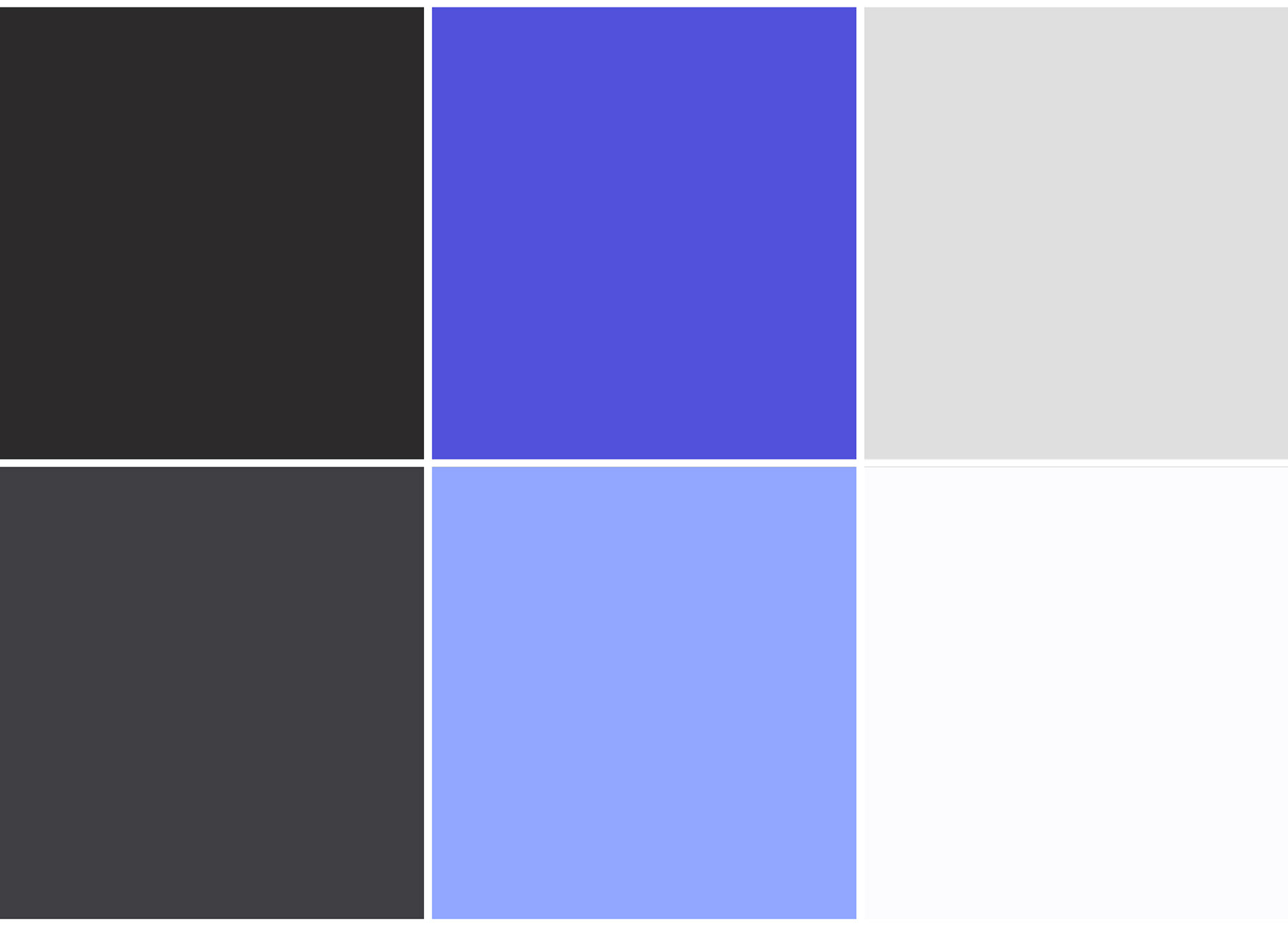
Blue is associated with trust, clarity and precision. Charcoal adds authority and reliability, while the lighter neutrals support the idea of transparency and open systems.
So I propose staying within the same overall colour territory as your current palette.
The shades themselves are new, selected to give the identity a more premium, restrained and authoritative feel.
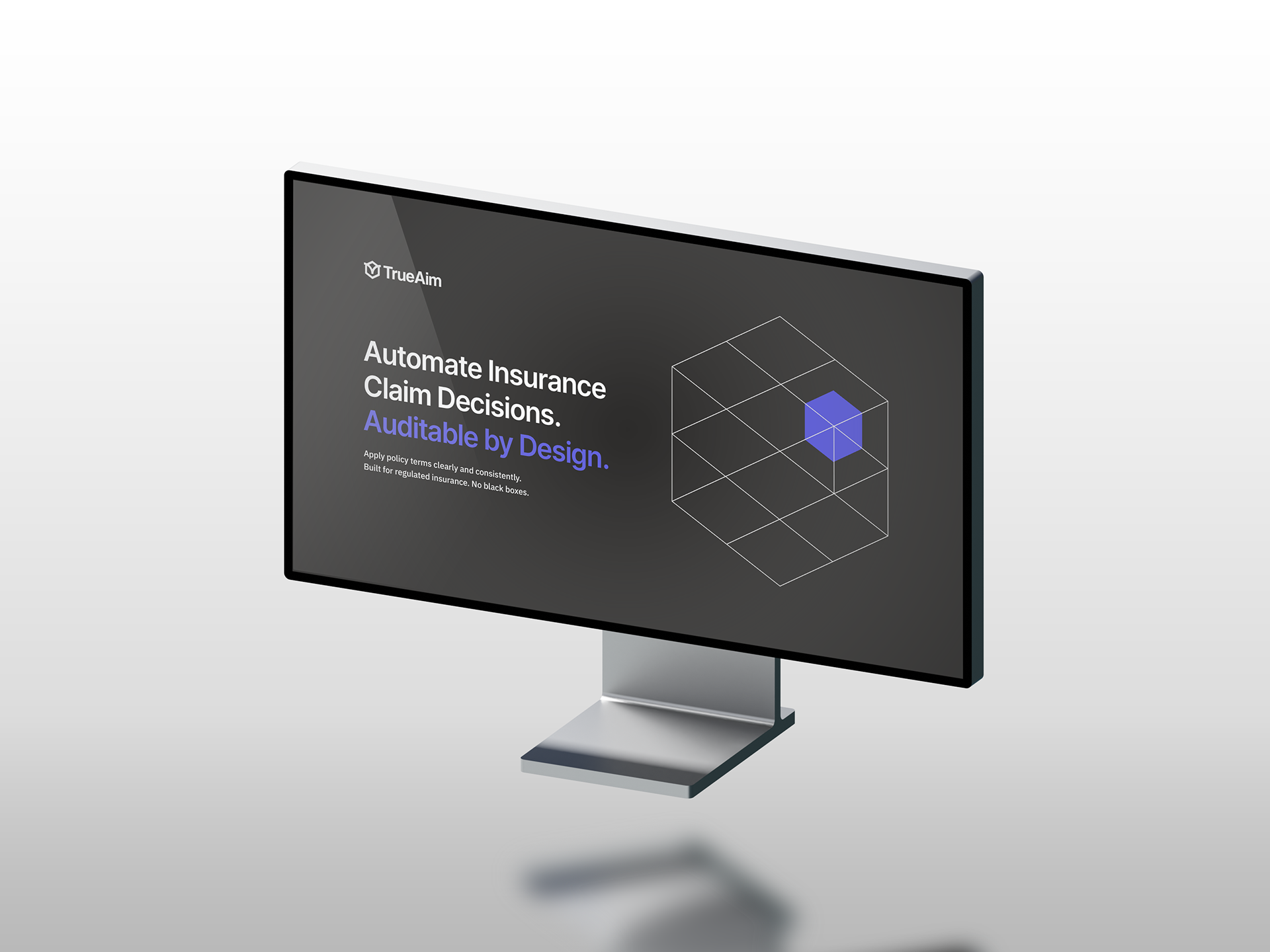
Not an actual web page proposal, but an example of the overall look and feel.