
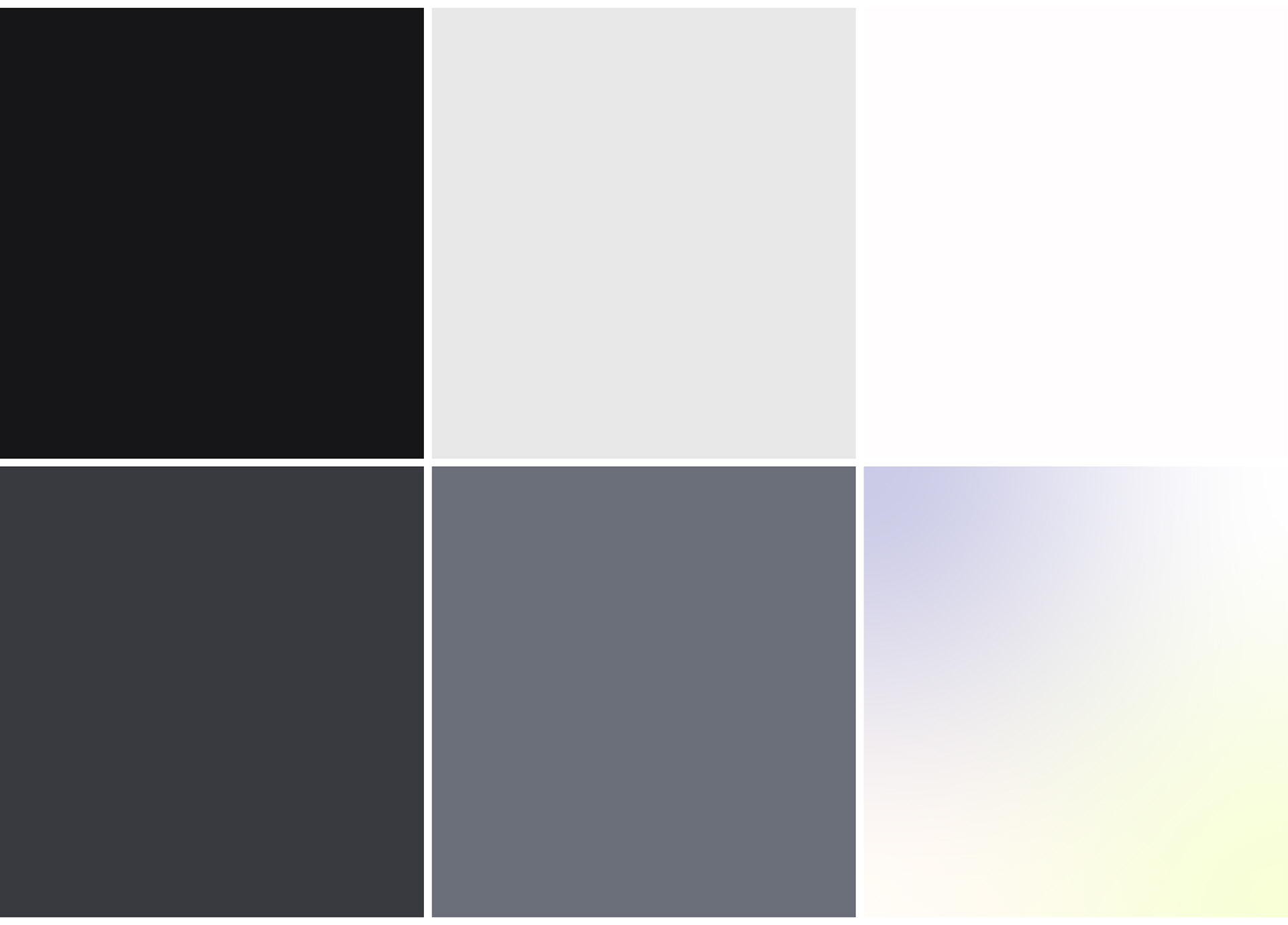
Black
Used for core elements and contrast.
Signals focus, authority, and precision.
Used for core elements and contrast.
Signals focus, authority, and precision.
Soft Light Grey
The primary canvas.
Keeps the system calm, neutral, and unobtrusive.
The primary canvas.
Keeps the system calm, neutral, and unobtrusive.
Soft Off-White
A calm, neutral base that reduces visual noise.
Creates space for thinking and keeps interfaces breathable and balanced.
A calm, neutral base that reduces visual noise.
Creates space for thinking and keeps interfaces breathable and balanced.
Deep Slate Grey
A structured secondary tone.
Adds weight and stability without visual noise.
A structured secondary tone.
Adds weight and stability without visual noise.
Muted Steel Grey
Functional and balanced.
Supports data, charts, and secondary layers.
Functional and balanced.
Supports data, charts, and secondary layers.
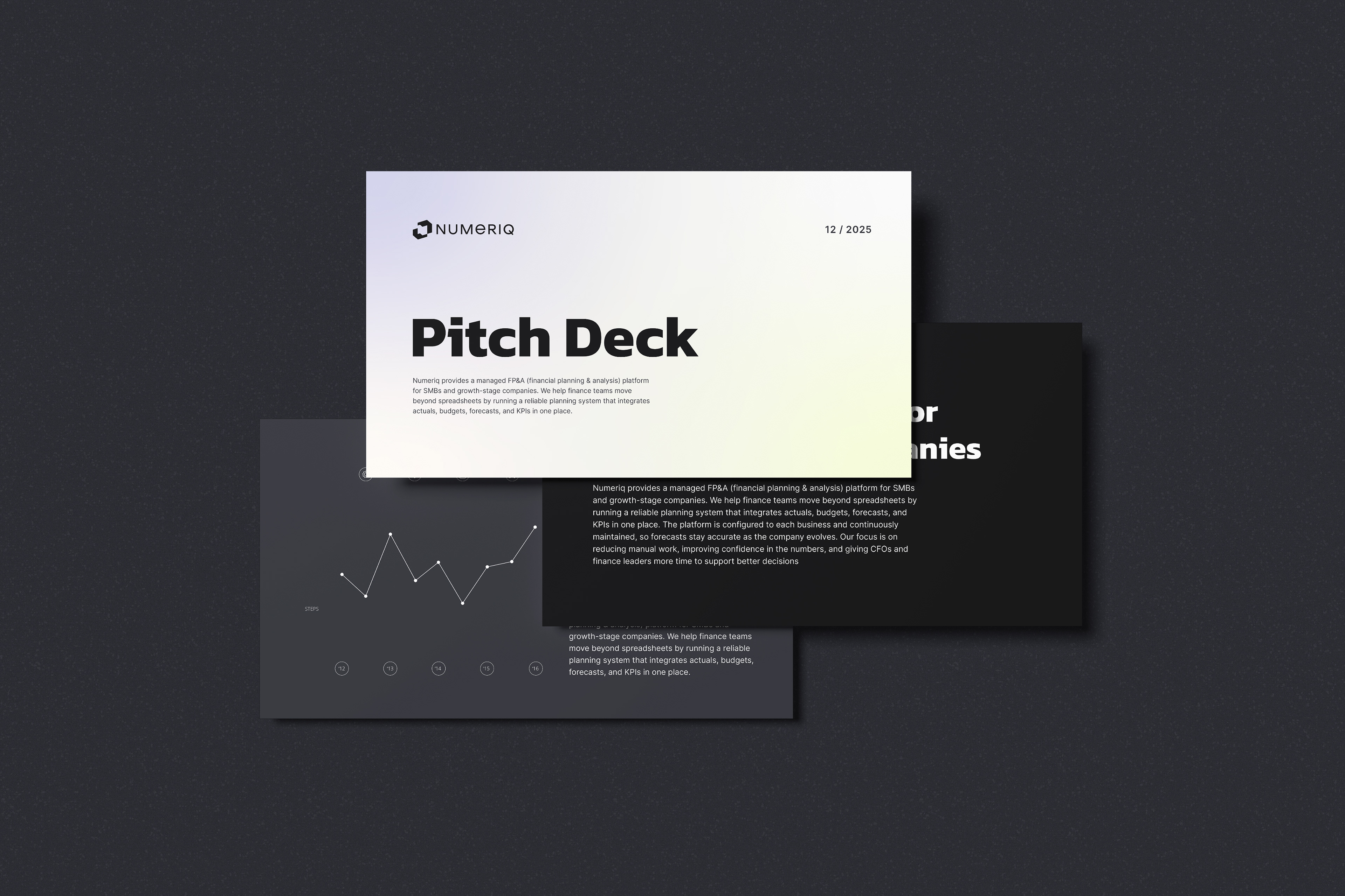
Soft Gradient
A soft, neutral gradient reserved for covers and presentation materials.
It supports the brand emotionally while keeping the core system clean, structured, and data-focused.
A soft, neutral gradient reserved for covers and presentation materials.
It supports the brand emotionally while keeping the core system clean, structured, and data-focused.