
This is not a literal product interface or final UI proposal.
The visuals are conceptual – meant to demonstrate tone, hierarchy, and brand attitude.
Clear. Focused. Reassuring.
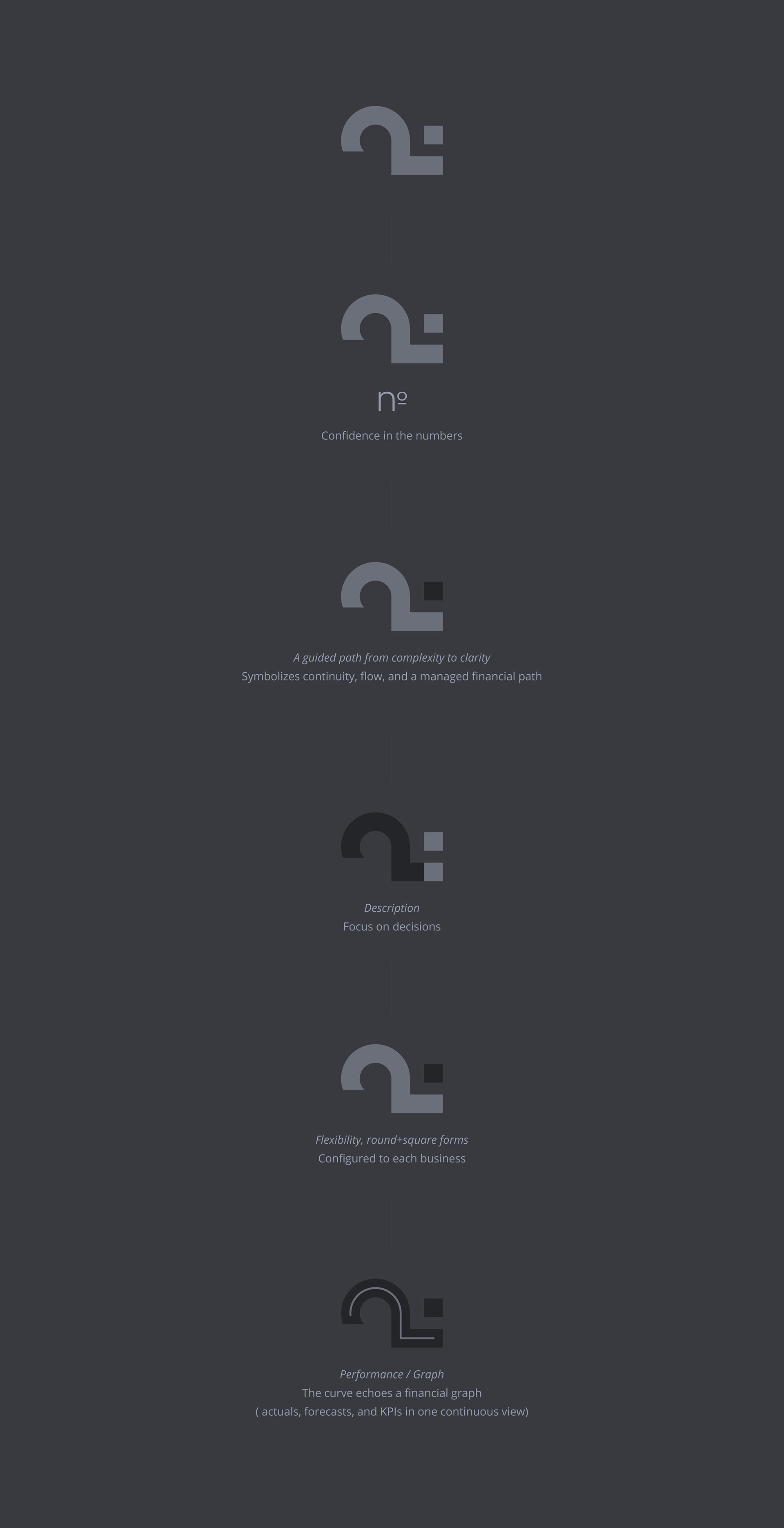
The visual system emphasizes confidence in the numbers and decisiveness.
Designed to reduce cognitive load and bring immediate clarity.
The visual system emphasizes confidence in the numbers and decisiveness.
Designed to reduce cognitive load and bring immediate clarity.
Typography: DM Sans + Open Sans
( confident, contemporary, approachable )


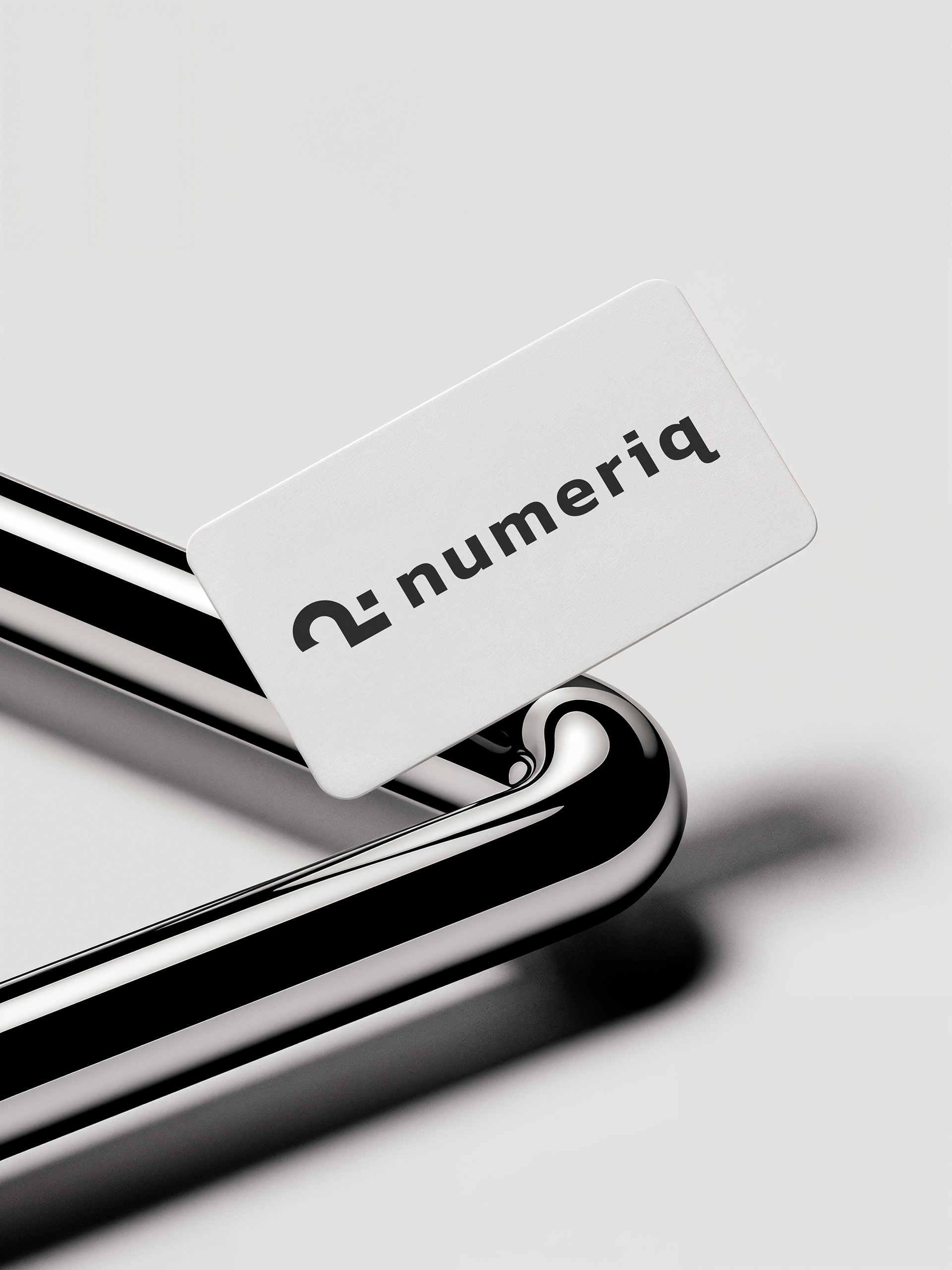
Black
Used for core elements and contrast.
Signals focus, authority, and precision.
Used for core elements and contrast.
Signals focus, authority, and precision.
Soft Light Grey
The primary canvas.
Keeps the system calm, neutral, and unobtrusive.
The primary canvas.
Keeps the system calm, neutral, and unobtrusive.
Deep Slate Grey
A structured secondary tone.
Adds weight and stability without visual noise.
A structured secondary tone.
Adds weight and stability without visual noise.
Muted Steel Grey
Functional and balanced.
Supports data, charts, and secondary layers.
Functional and balanced.
Supports data, charts, and secondary layers.
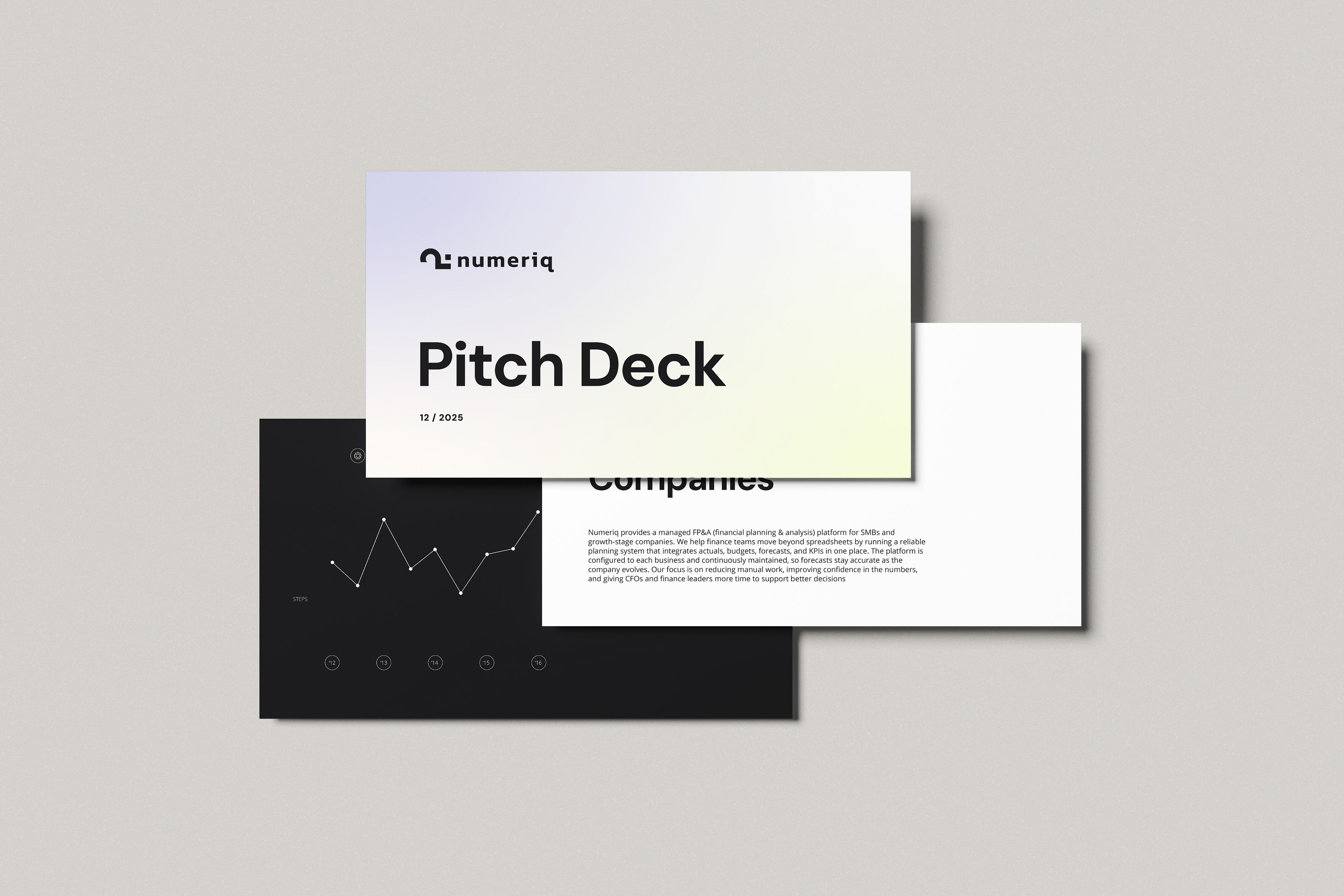
Soft Gradient
A soft, neutral gradient reserved for covers and presentation materials.
It supports the brand emotionally while keeping the core system clean, structured, and data-focused.
A soft, neutral gradient reserved for covers and presentation materials.
It supports the brand emotionally while keeping the core system clean, structured, and data-focused.

_________________________________________
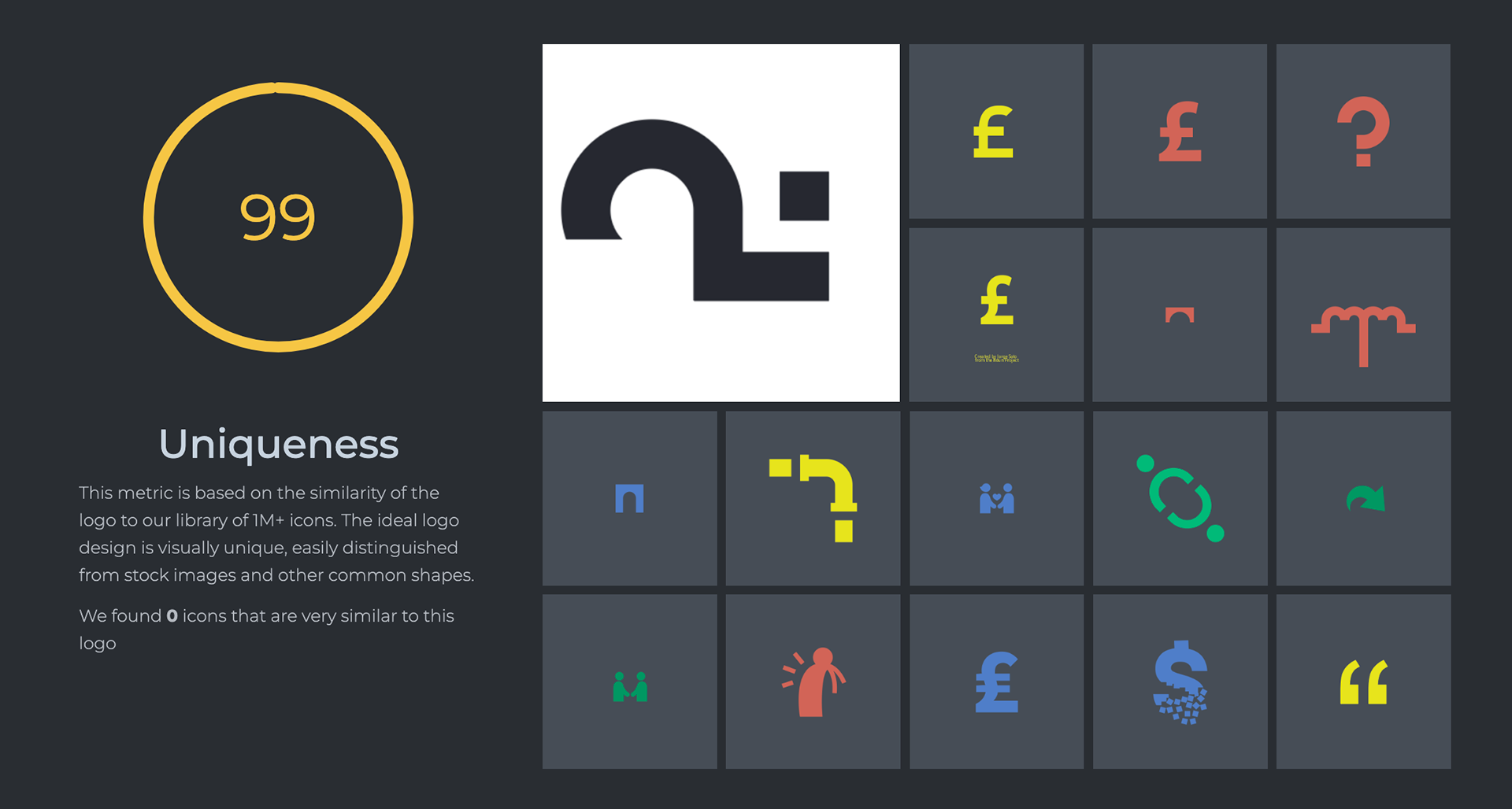
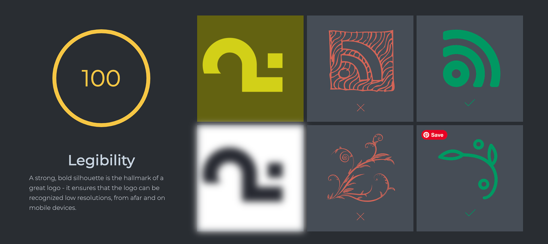
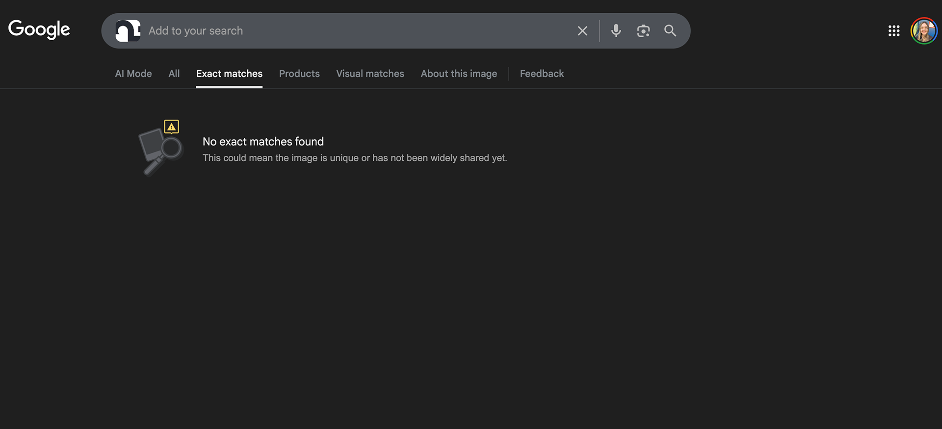
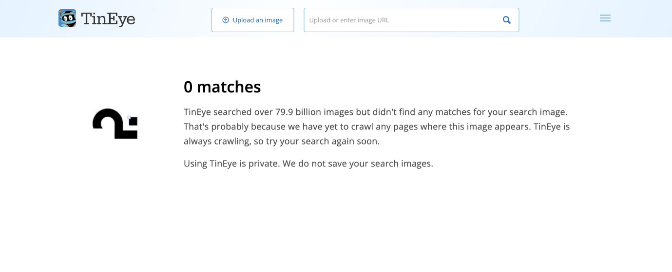
Visual Distinctiveness Validation
The mark was tested for distinctiveness and legibility against existing symbols.
No close visual matches were found.
No close visual matches were found.