

This is not a literal product interface or final UI proposal.
The visuals are conceptual – meant to demonstrate tone, hierarchy, and brand attitude.
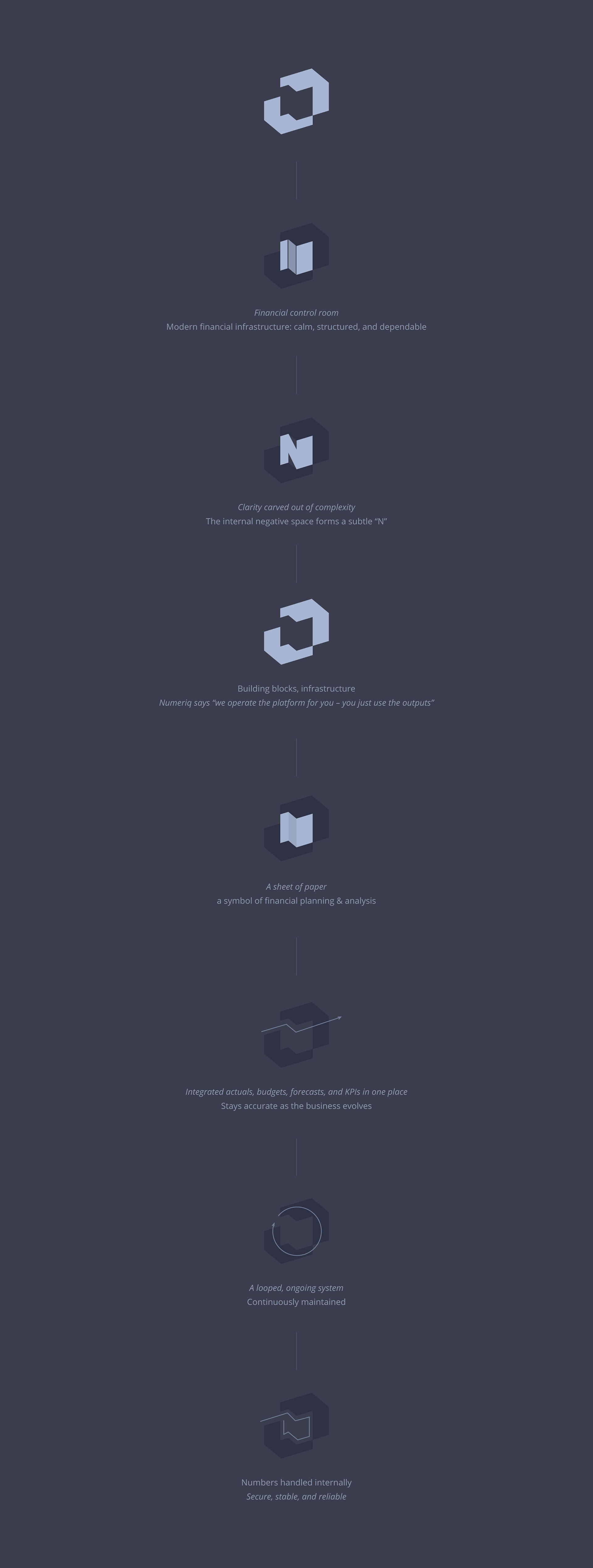
Structured. Calm. Intentional.
The visual system is built like infrastructure: minimal, precise, and reliable.
Every element serves clarity and decision-making – nothing is decorative.
The visual system is built like infrastructure: minimal, precise, and reliable.
Every element serves clarity and decision-making – nothing is decorative.
Typography: Kanit + Inter
( calm, precise, modern yet classic )


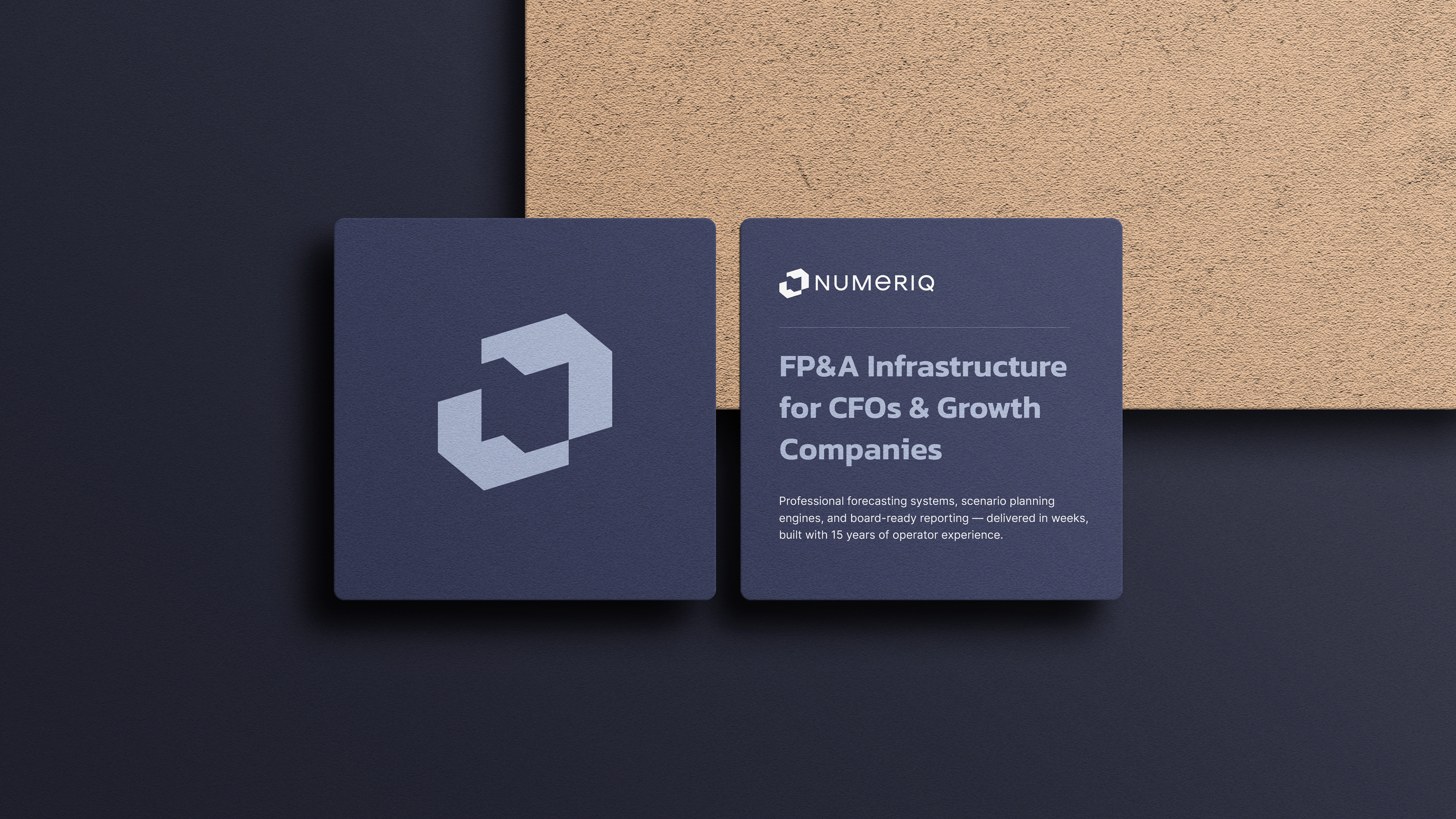
Deep Navy
Core color representing stability, trust, and financial authority.
Feels solid, calm, and dependable.
Core color representing stability, trust, and financial authority.
Feels solid, calm, and dependable.
Graphite / Dark Grey
Supports structure and focus.
Reduces visual noise and keeps attention on the data.
Supports structure and focus.
Reduces visual noise and keeps attention on the data.
Soft Warm White
Creates space and clarity.
Makes complex information easier to read and process.
Creates space and clarity.
Makes complex information easier to read and process.
Muted Blue-Grey
Signals precision and intelligence without aggression.
Signals precision and intelligence without aggression.
Warm Neutral / Beige Accent
Adds balance and humanity.
Softens the system without undermining seriousness.
Adds balance and humanity.
Softens the system without undermining seriousness.


_________________________________________
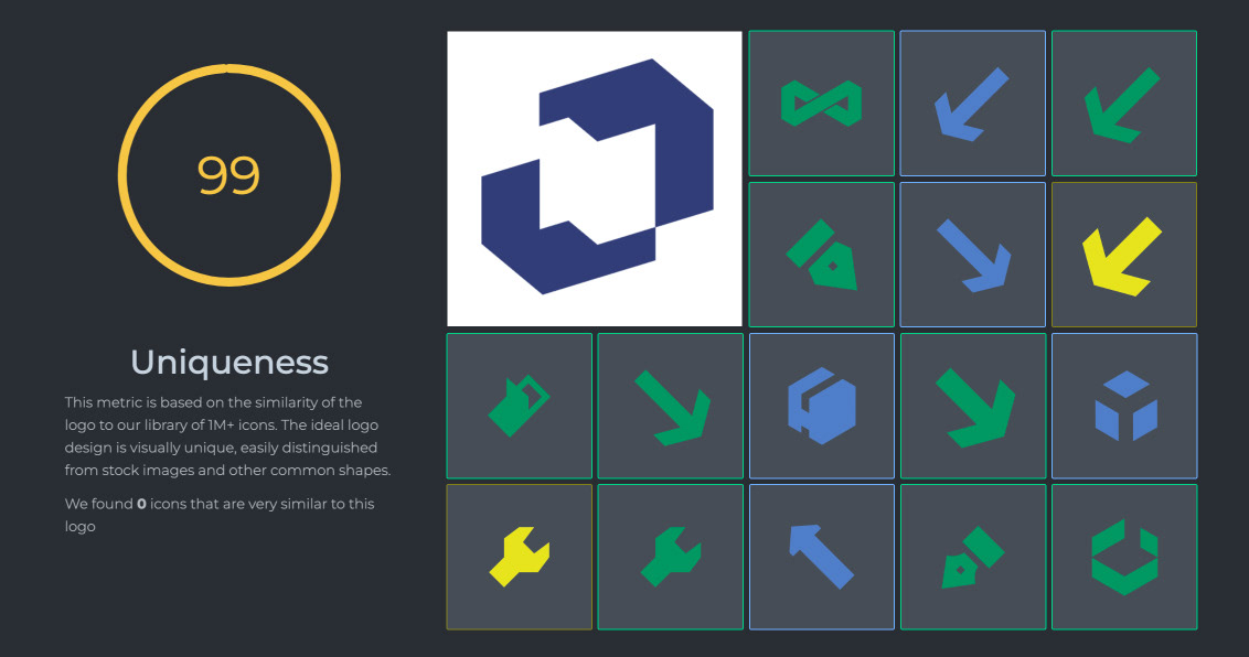
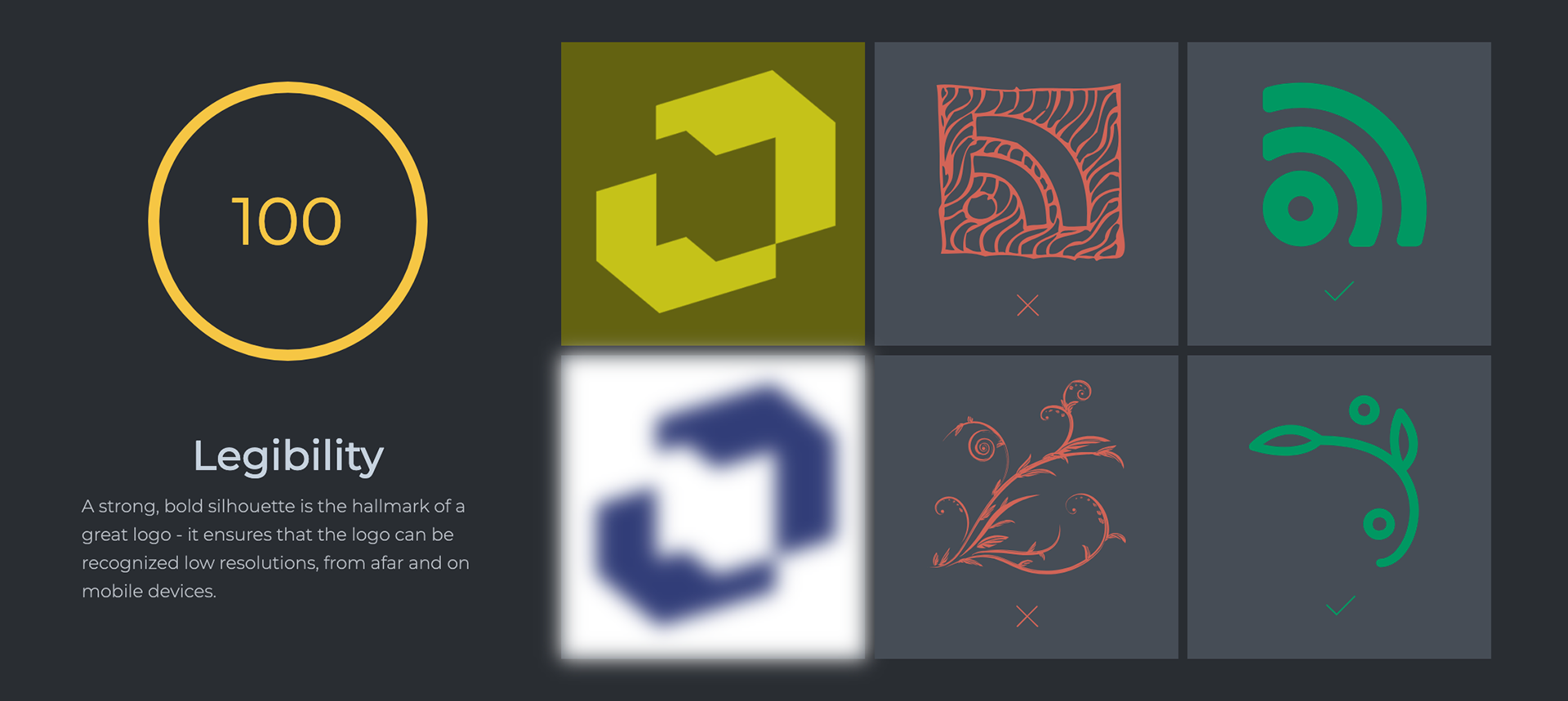
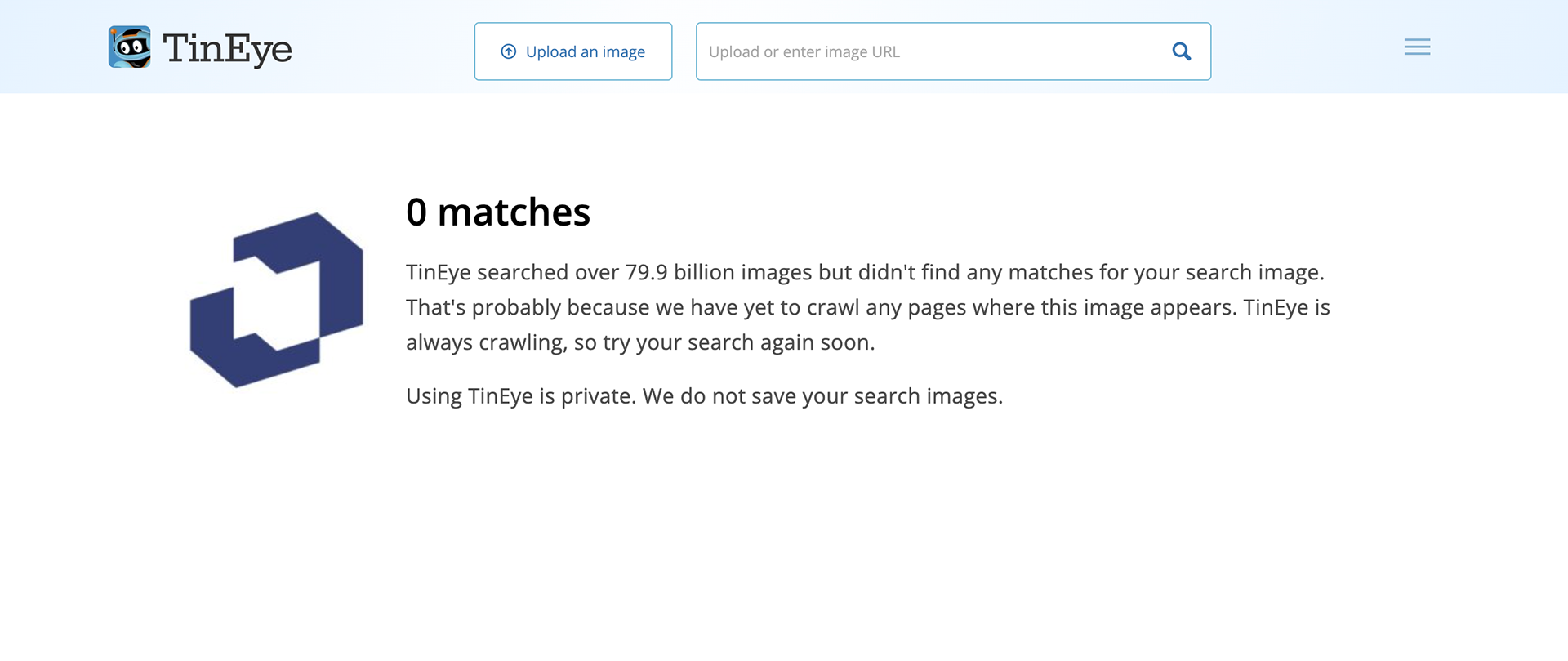
Visual Distinctiveness Validation
The mark was tested for distinctiveness and legibility against existing symbols.
No close visual matches were found.
No close visual matches were found.