BX.
Primary logo
Bold, minimal and self-explanatory.
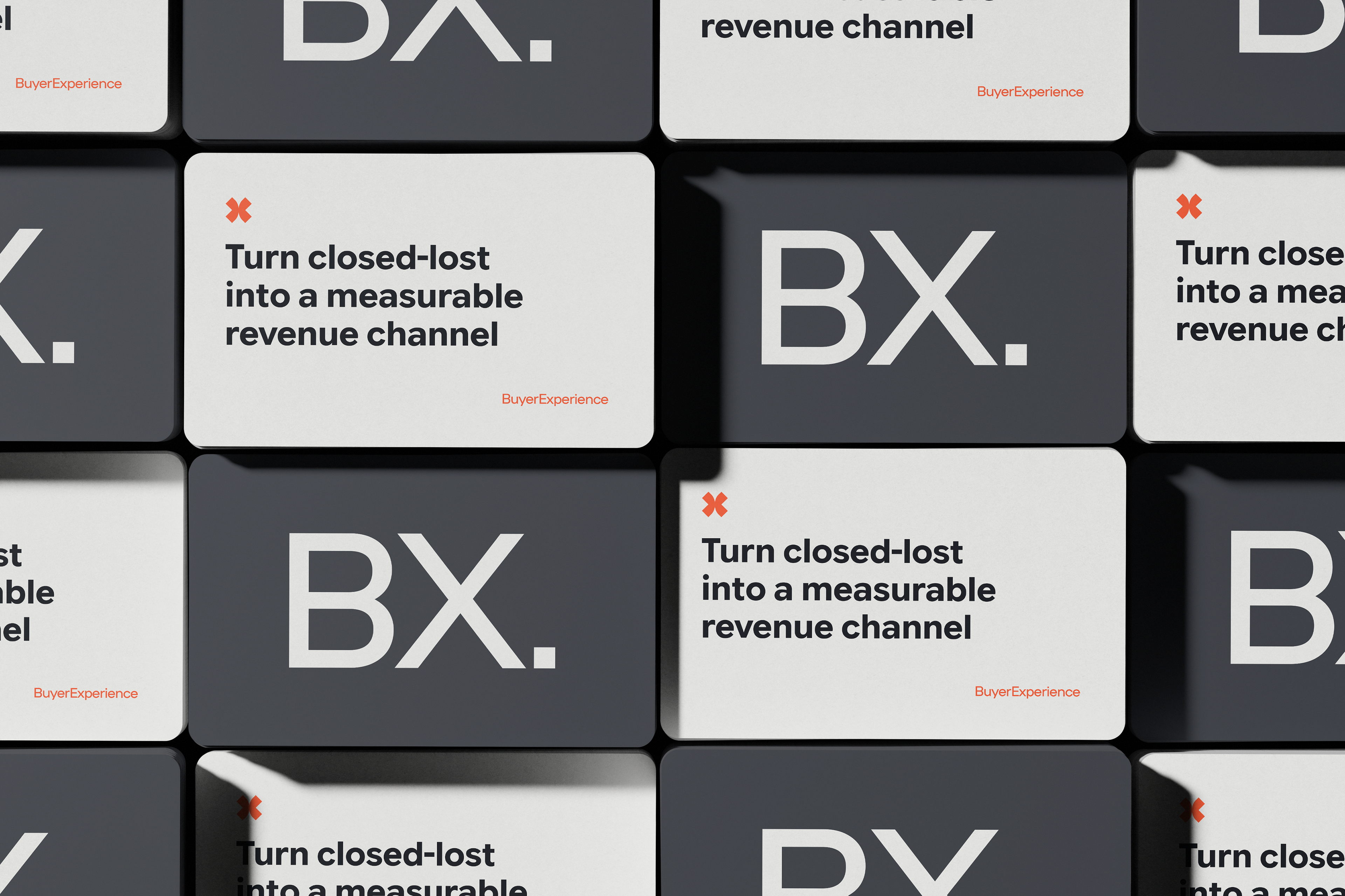
BX. becomes the primary brand signature used across all core communications. The direct abbreviation supports the ambition to make BX synonymous with revenue recovery: “Who does this? BX.”
The squared full stop gives the logo confidence and finality, turning the name into a clear statement rather than simply an abbreviation.

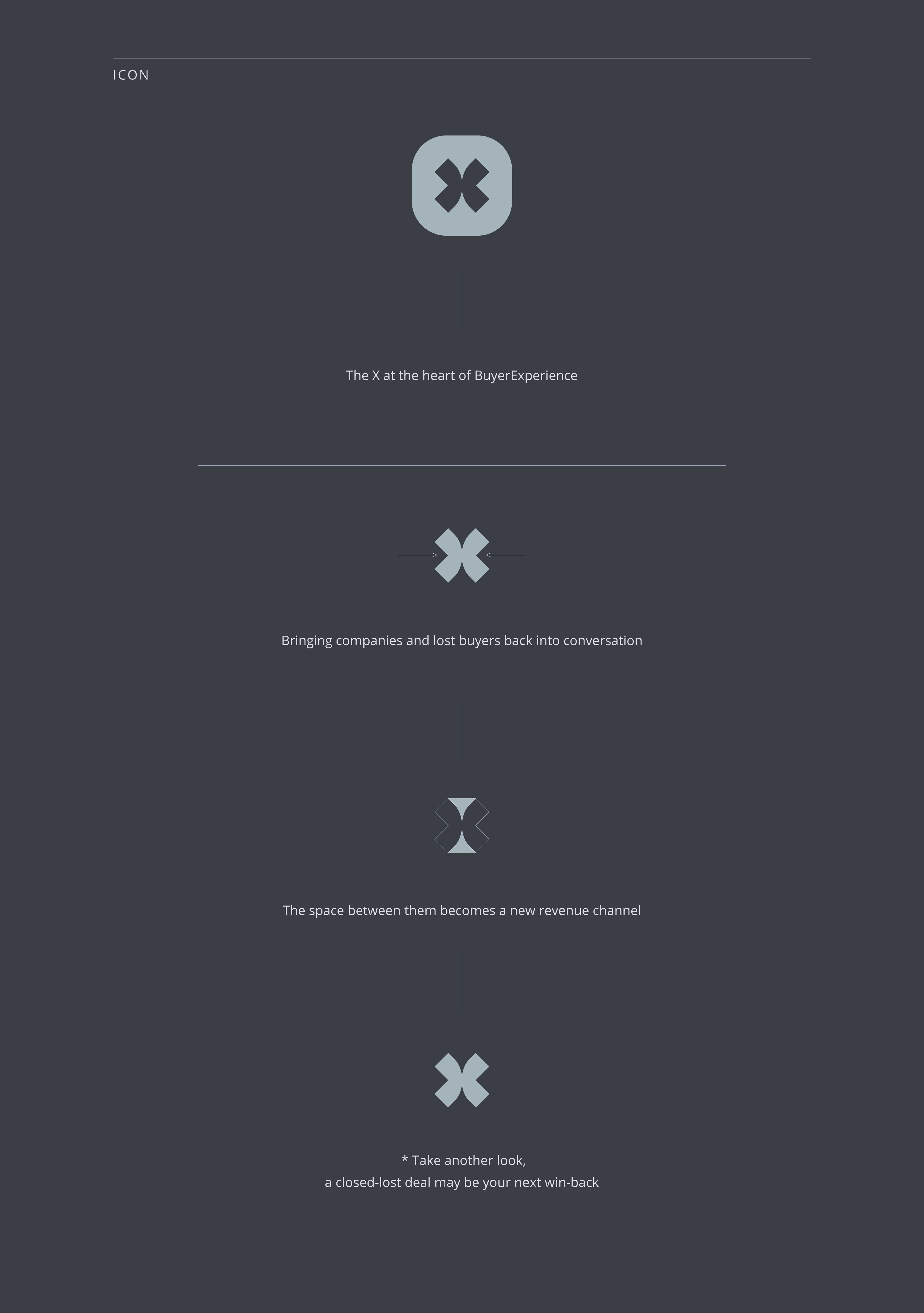
The icon
A custom X derived from the BX name.
The icon works independently as an avatar and favicon, and throughout the visual system as a graphic element, highlight or punctuation-like device for key messages.
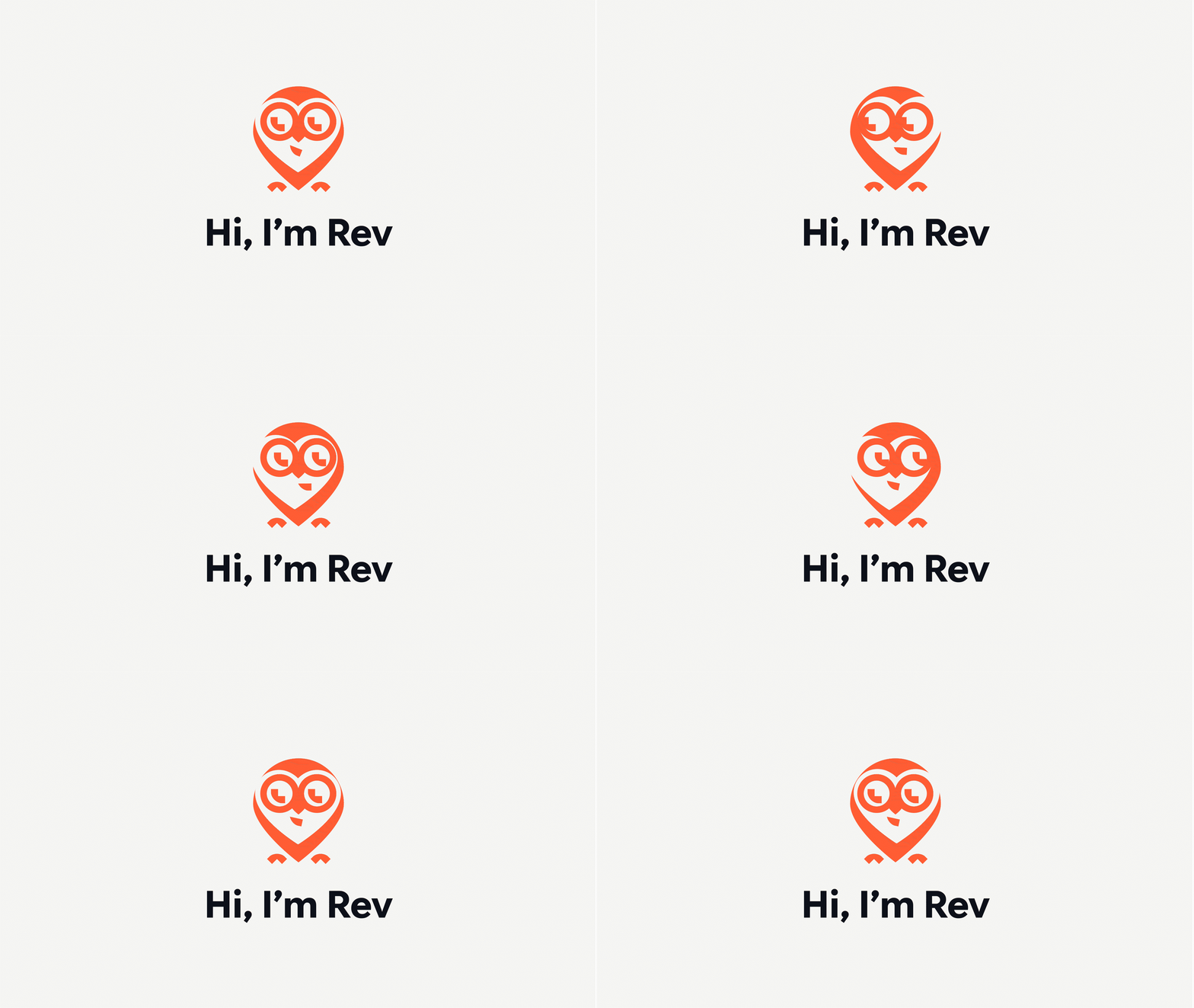
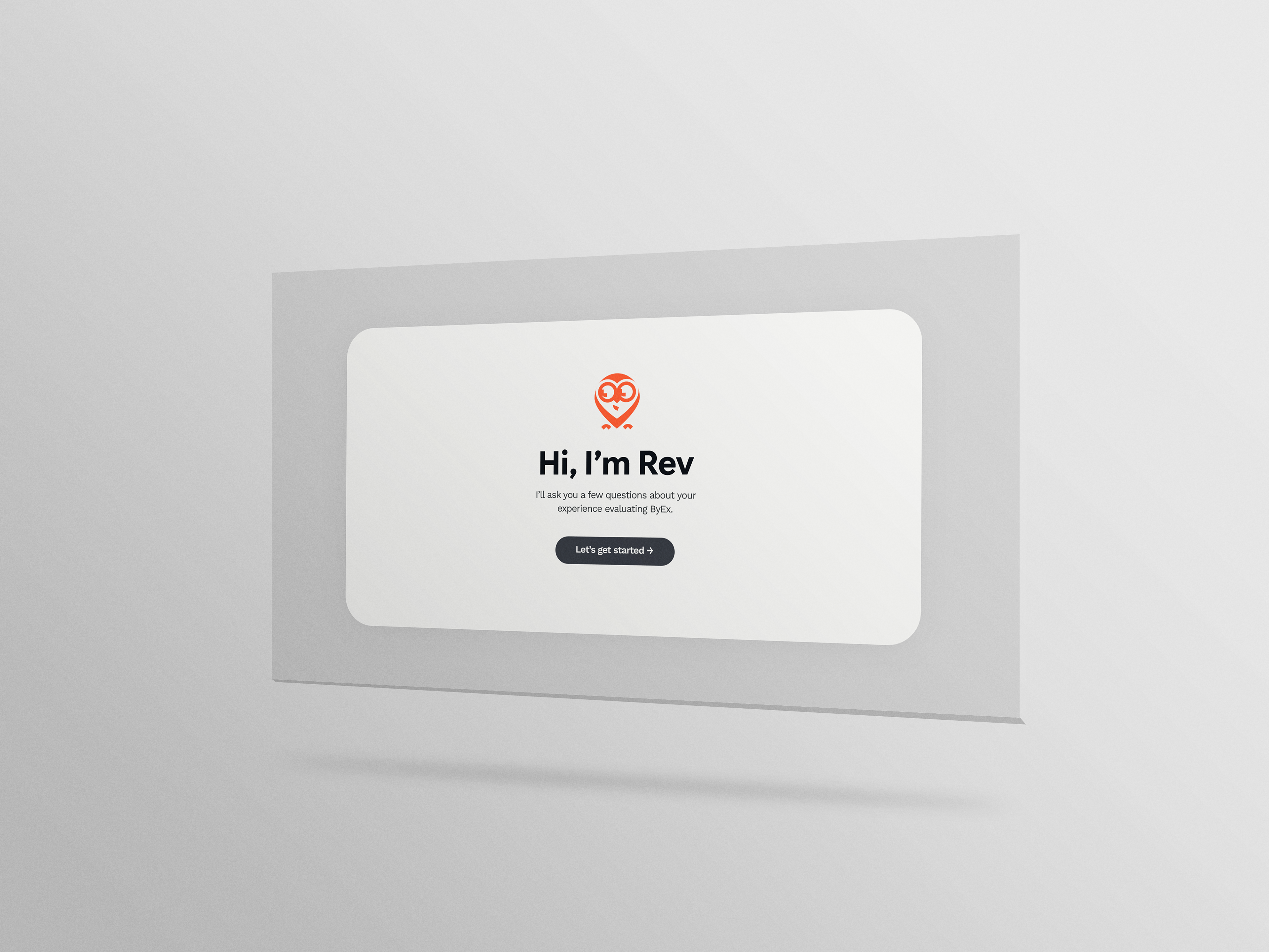
Rev is geometric yet approachable, with a subtle heart-shaped face that adds warmth to the character.
Simple animations could bring Rev into the survey experience through introductions, transitions and completion moments, reinforcing the gamified aspect of the brand.

Color palette
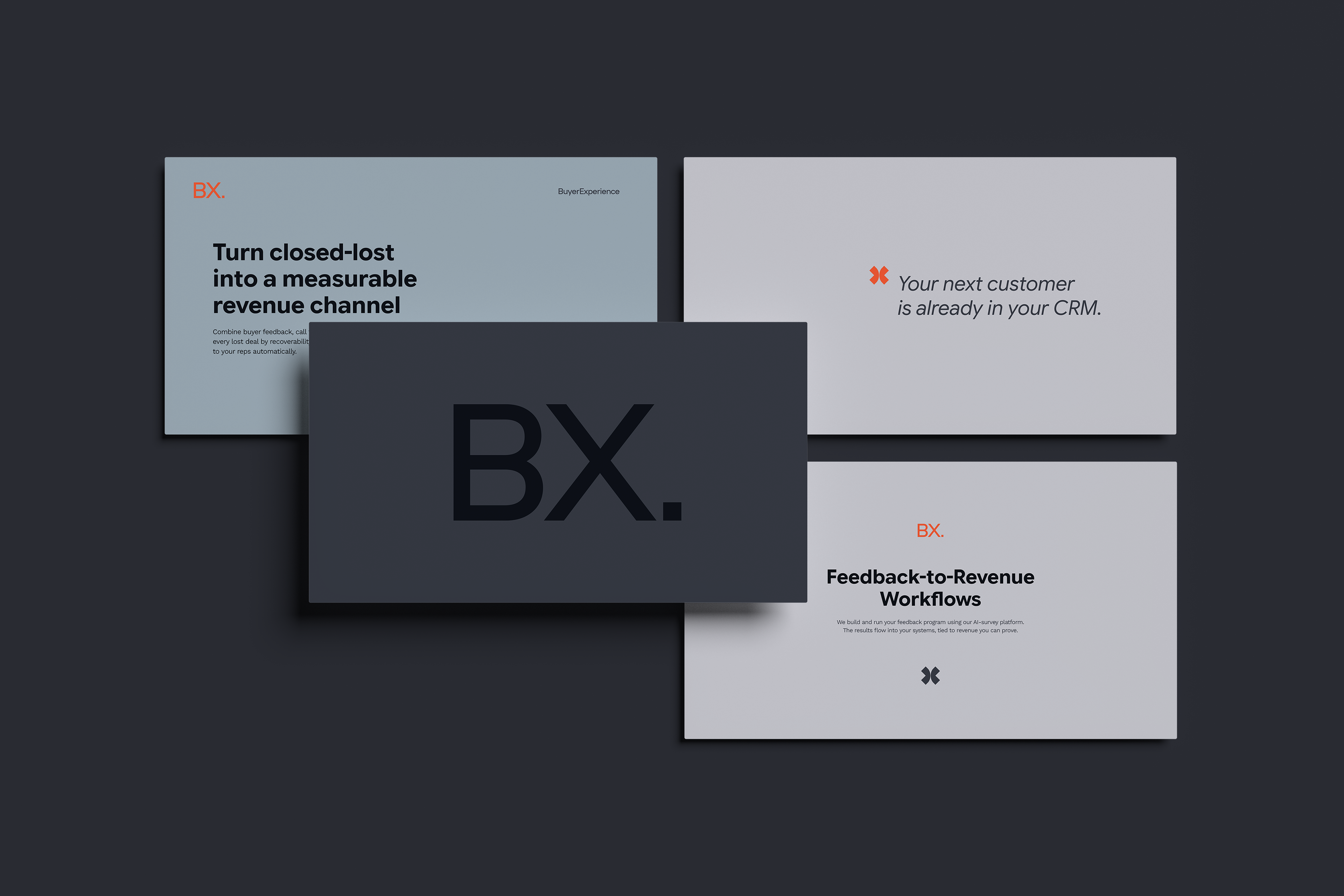
Deep neutrals create a premium, professional foundation, while soft greys keep the system clear and refined.
The vivid orange is used sparingly and with purpose: to highlight key messages, insights and moments of action. This gives the brand energy and distinction without compromising its minimal character.

Full wordmark
The BuyerExperience wordmark presents the full company name clearly. It can be used when introducing the brand or wherever the full name provides useful context, while BX. serves as the primary compact signature.
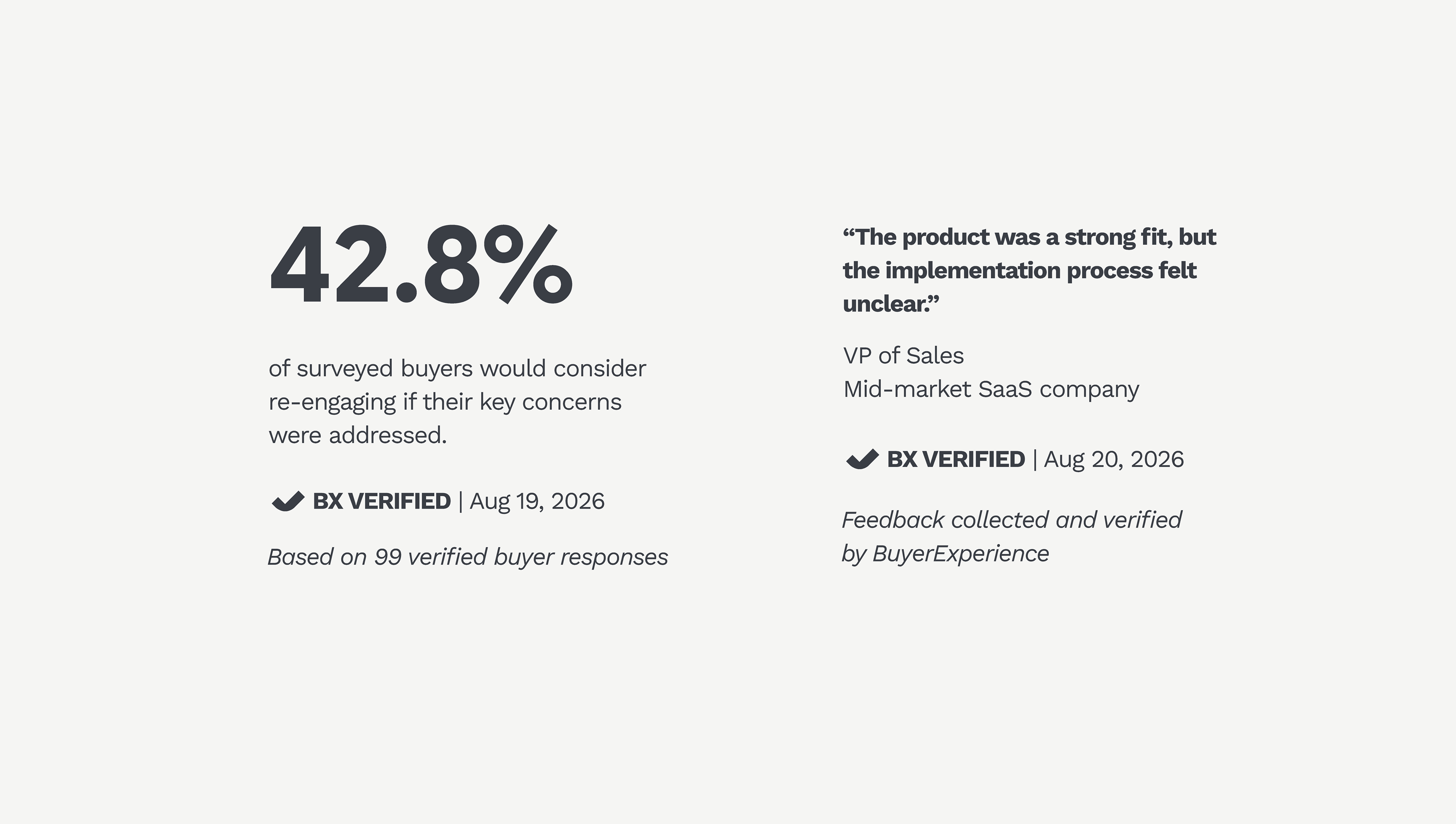
A custom verification mark, built from the same visual language as the BX icon.