Visual accents
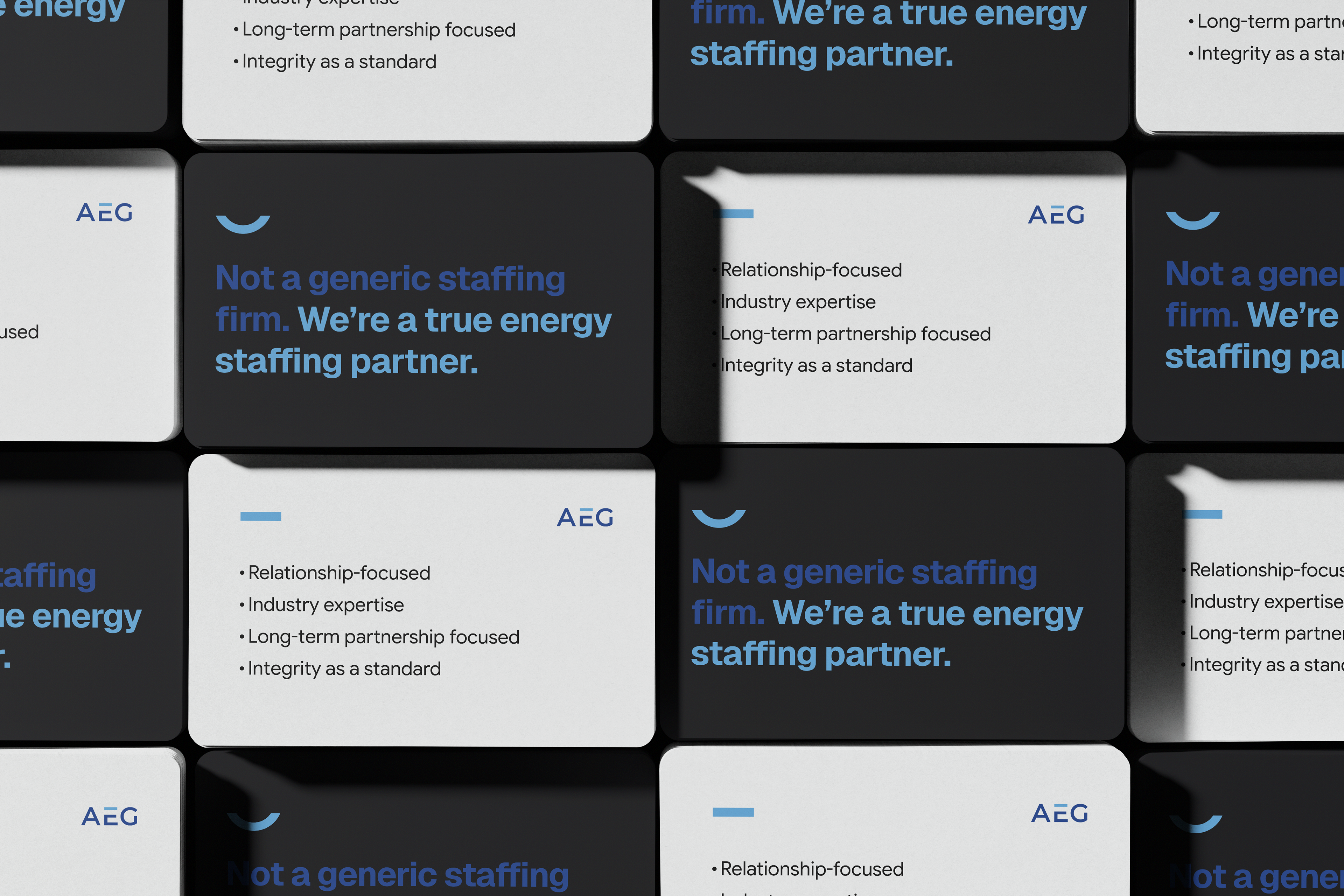
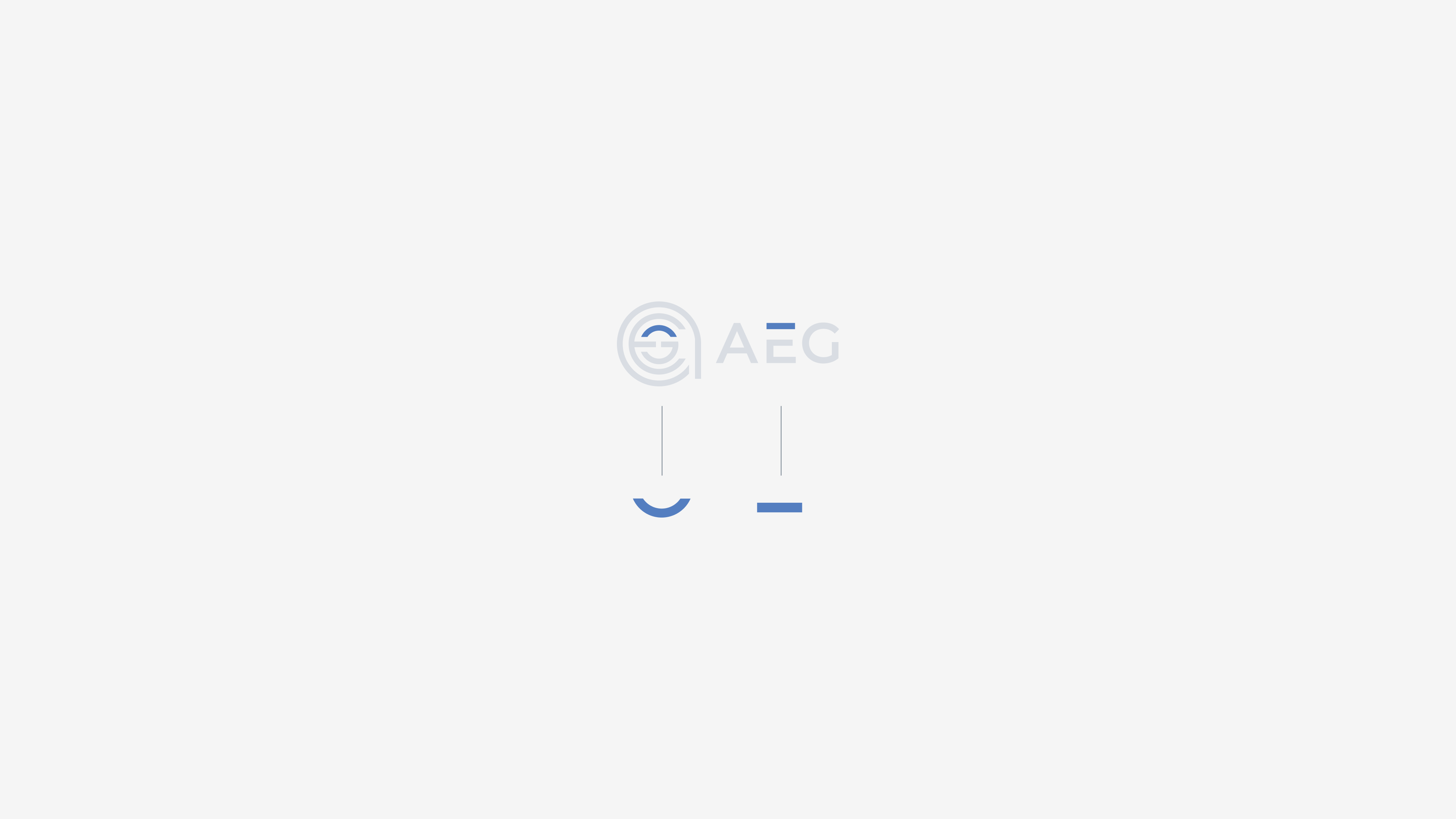
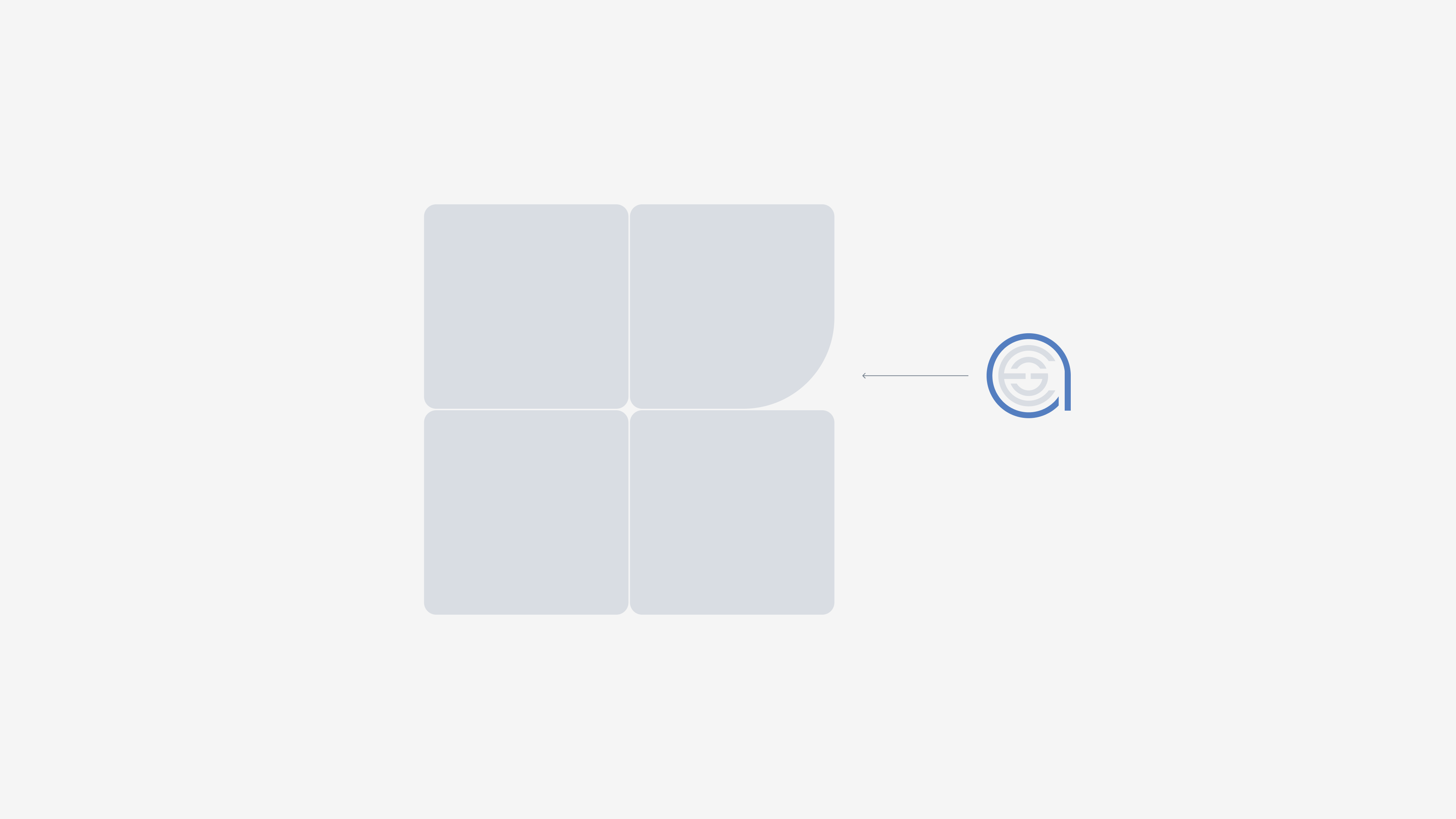
Derived directly from the AEG logo, these shapes extend its visual character beyond the mark itself. Used as recurring accents across layouts, they help make the brand more recognizable and consistent.
Grid system
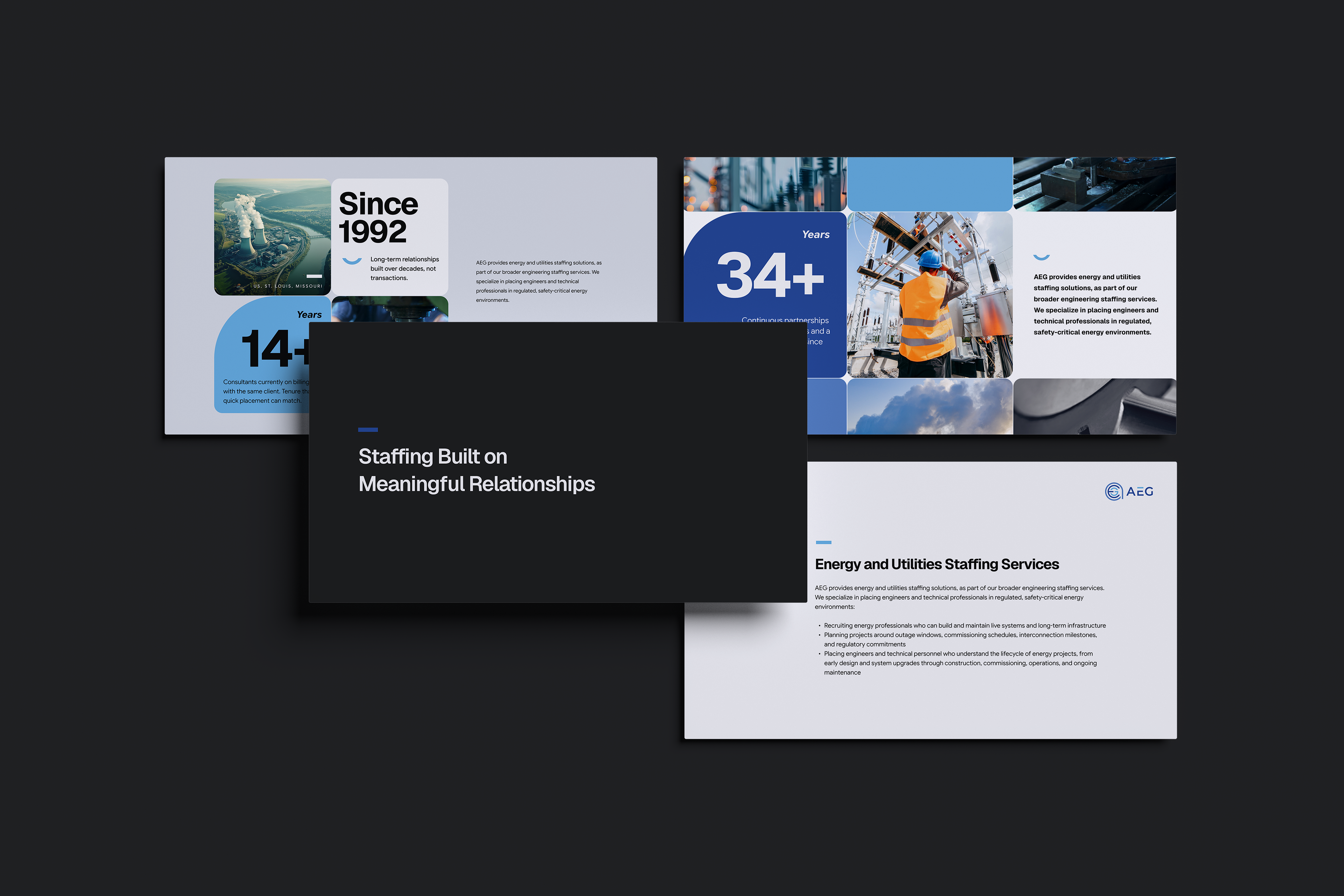
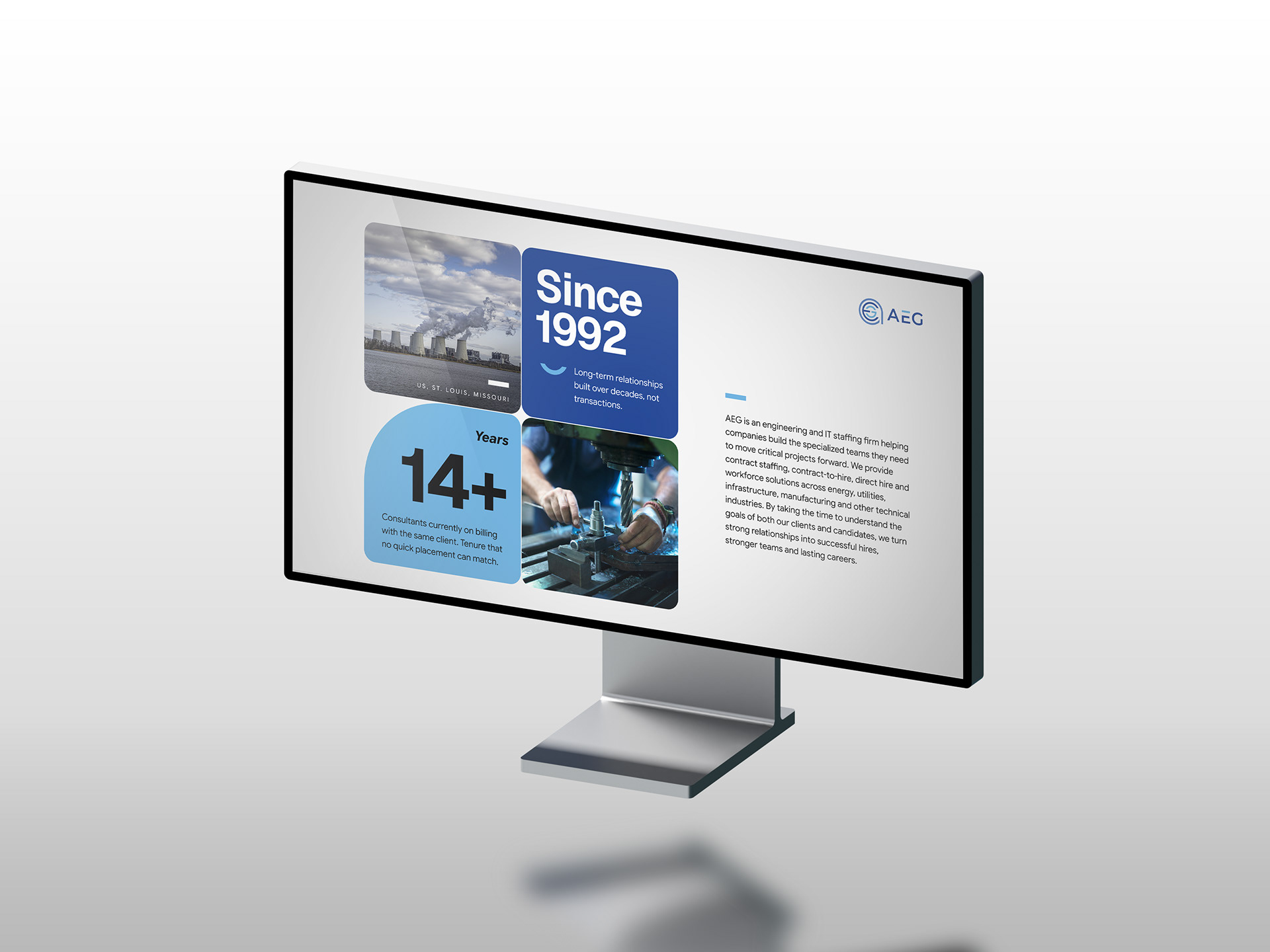
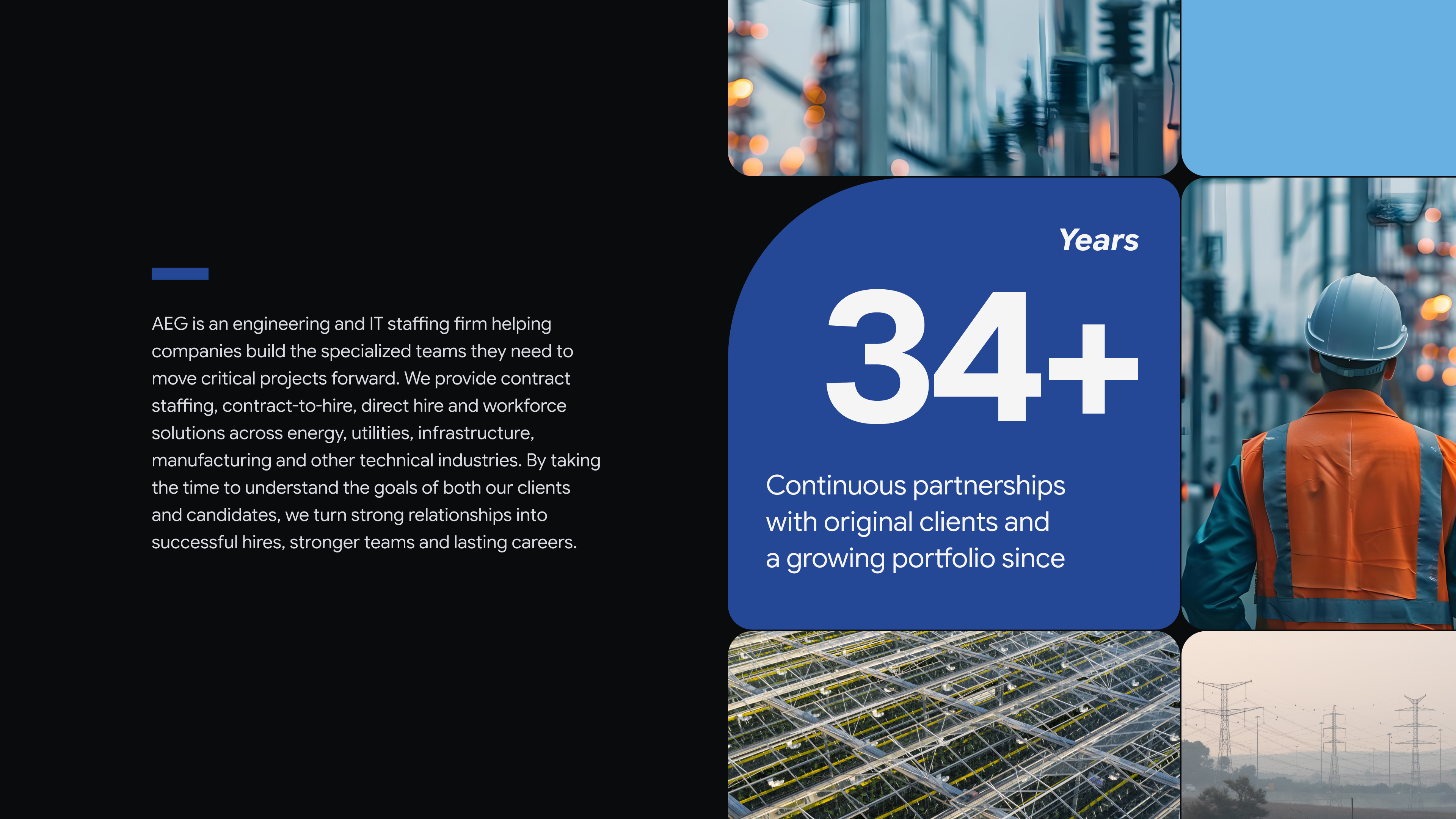
The grid follows the geometry of the AEG logo, combining subtle rounded corners with one distinctive curve. This small asymmetry turns a standard modular grid into a recognisable part of the AEG visual language.
Fonts:
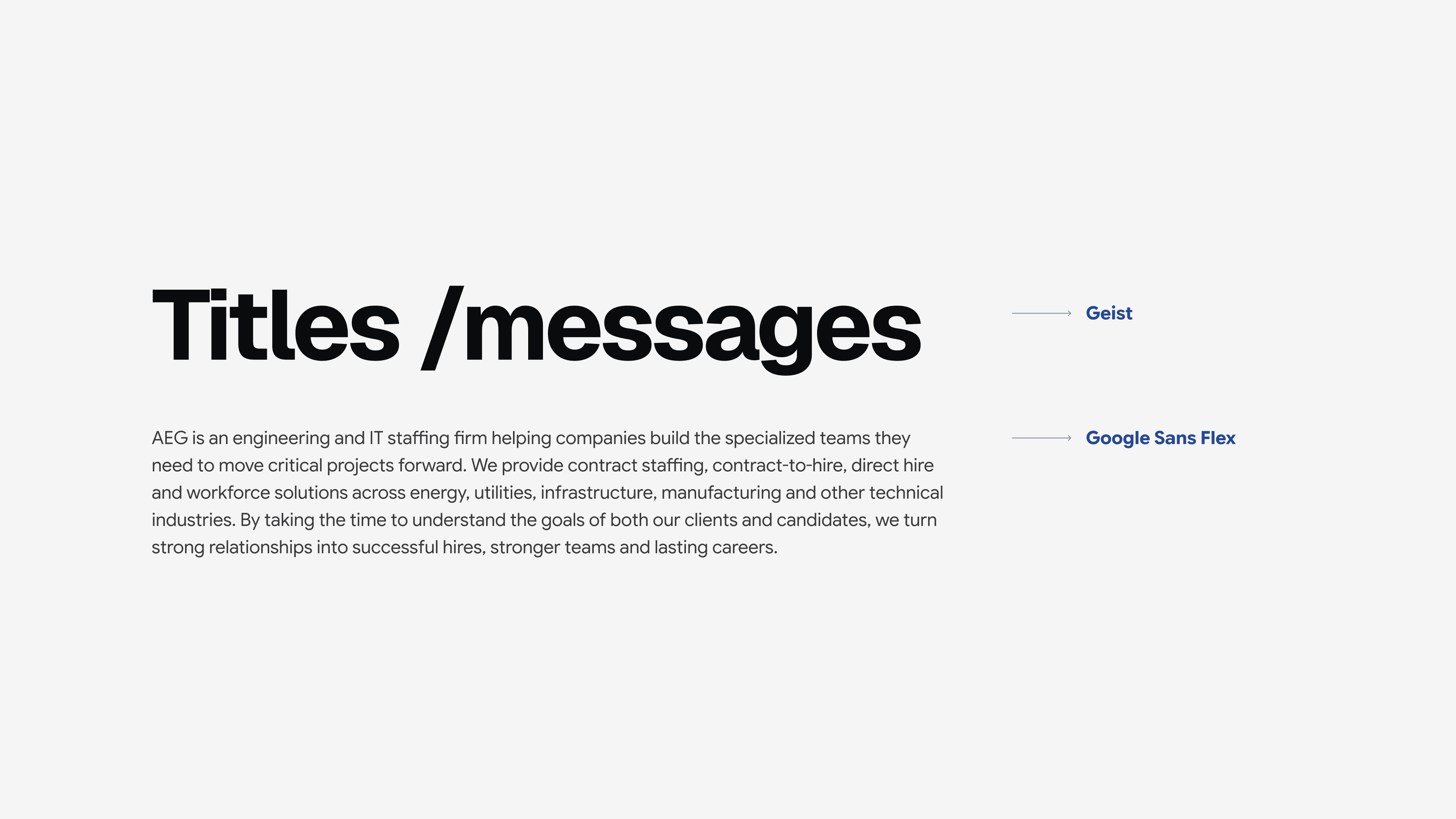
Geist and Google Sans Flex create a two-font system: Geist brings a stronger, more distinctive character to headlines and key messages, while Google Sans Flex provides a softer, highly readable voice for longer text. Both are open-source typefaces, making the system easy to use consistently across digital and everyday applications.

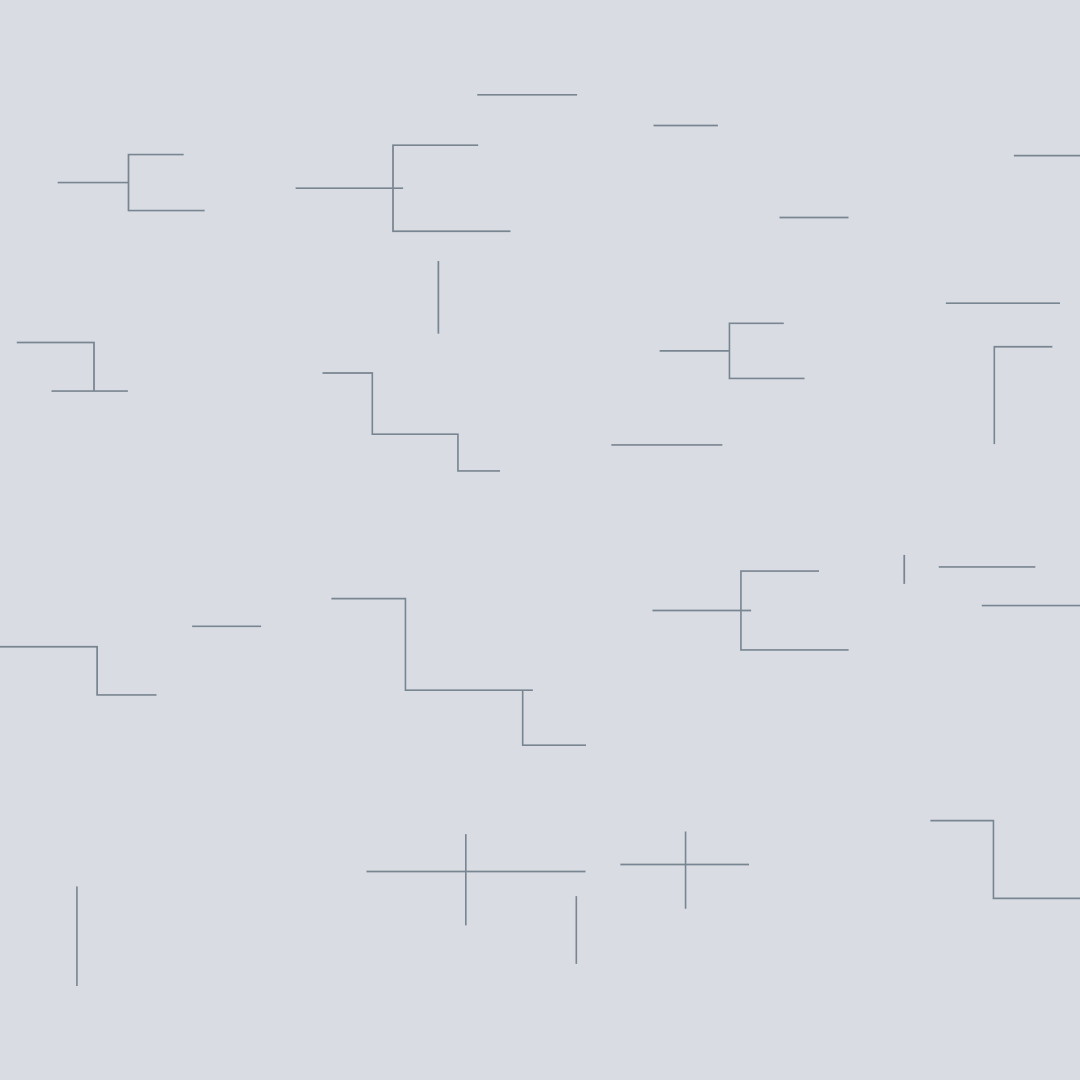
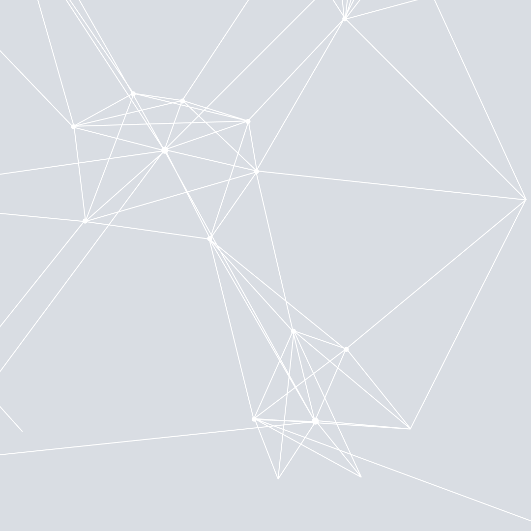
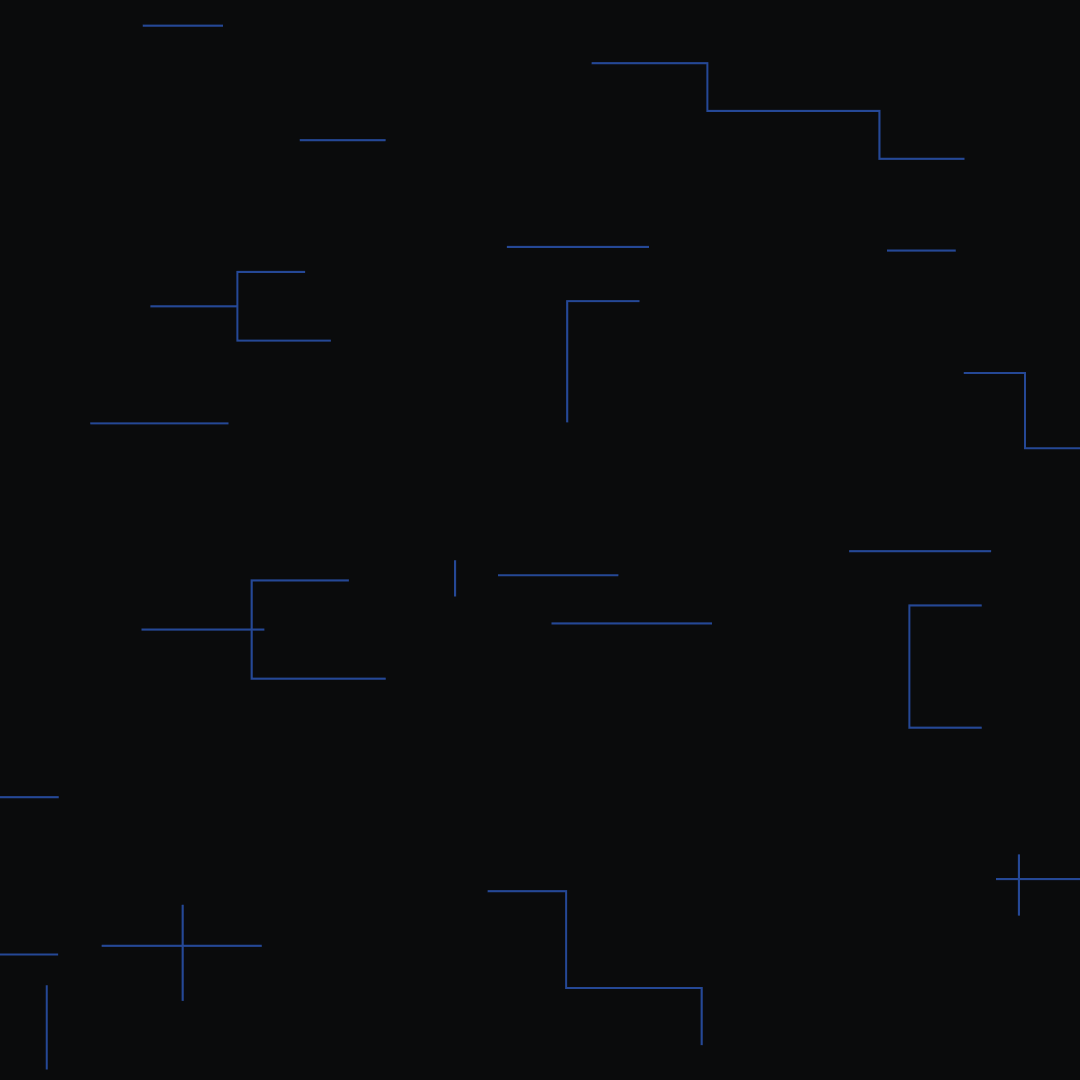
Graphic patterns
Supporting patterns add a more technical layer to the identity when needed, drawing on ideas of networks, infrastructure and interconnected systems.
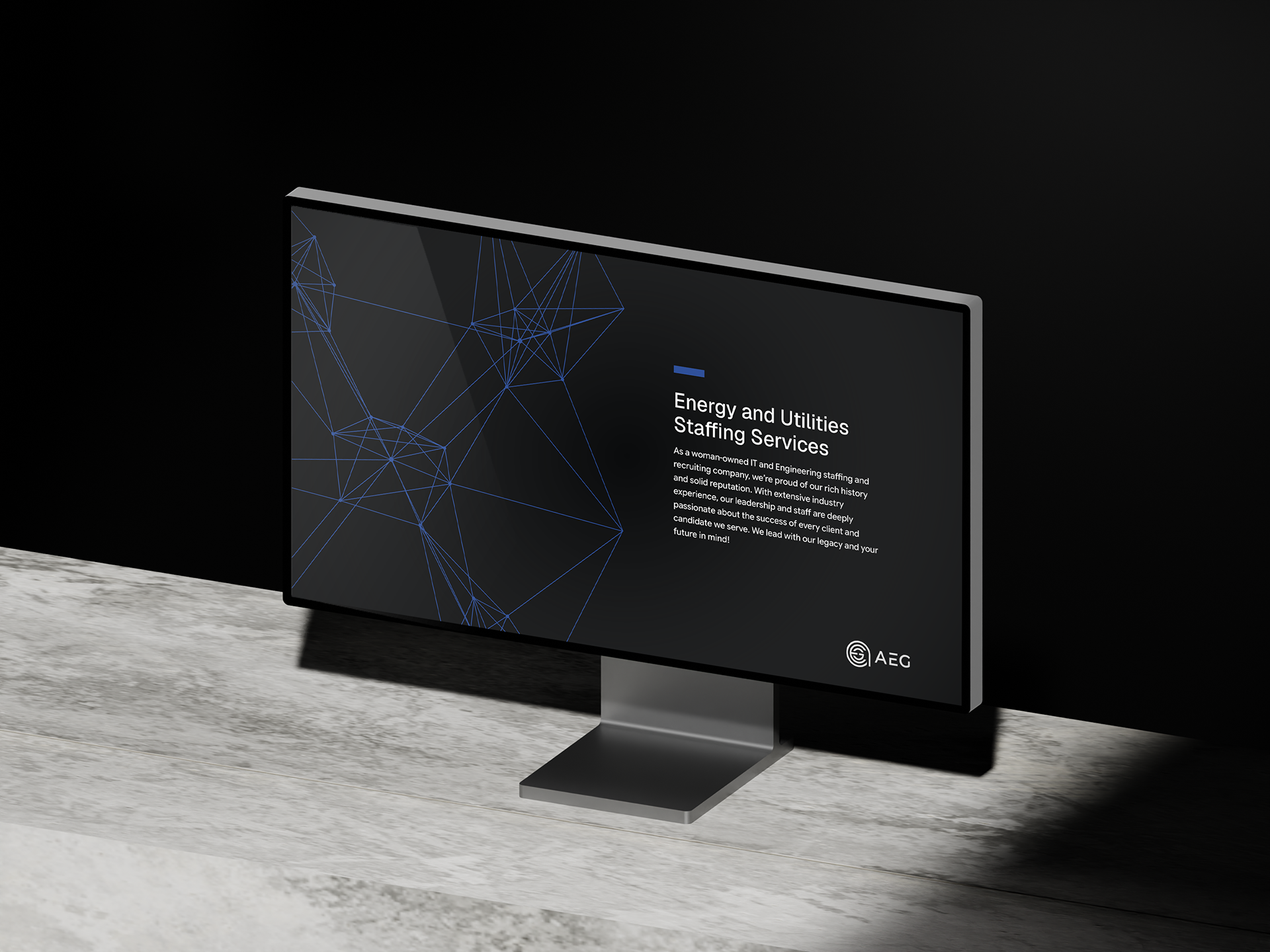
Overall visual approach
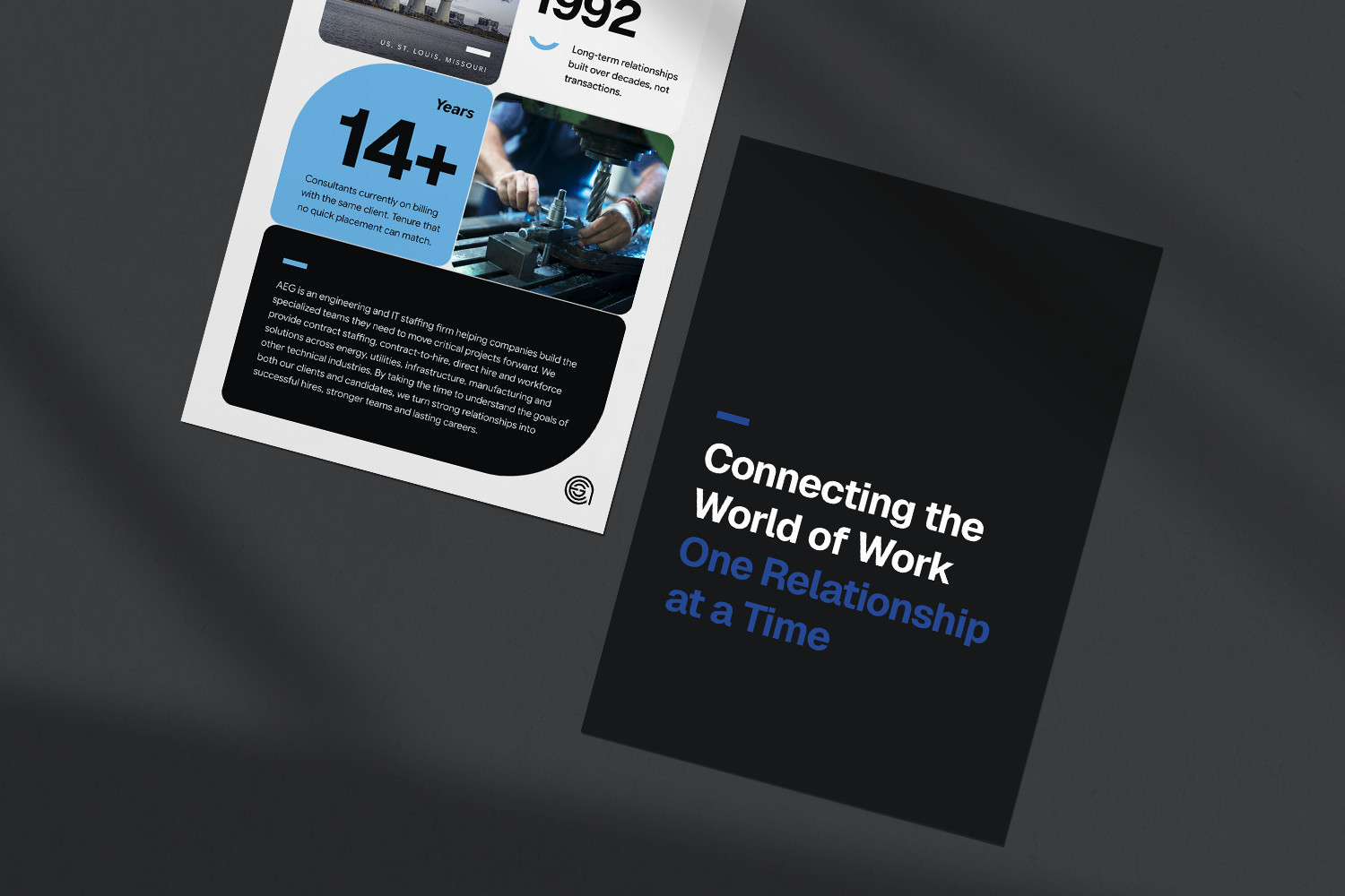
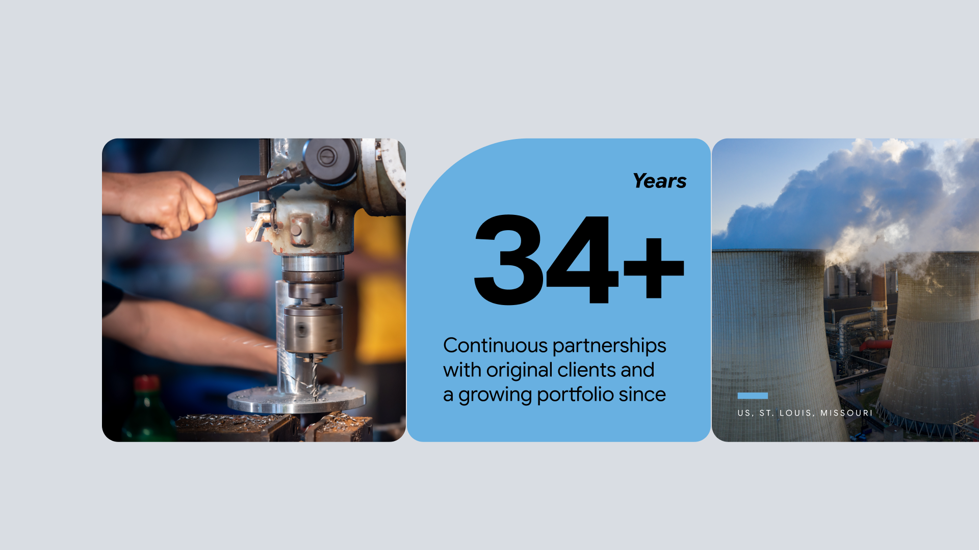
Light and dark backgrounds create the foundation of the system, while color is concentrated within grids, imagery and key accents. Modular compositions bring different types of content together while keeping layouts consistent and flexible across formats. Photography and video add a human layer to the system, combining people at work with the environments, infrastructure and details of the industries AEG serves.