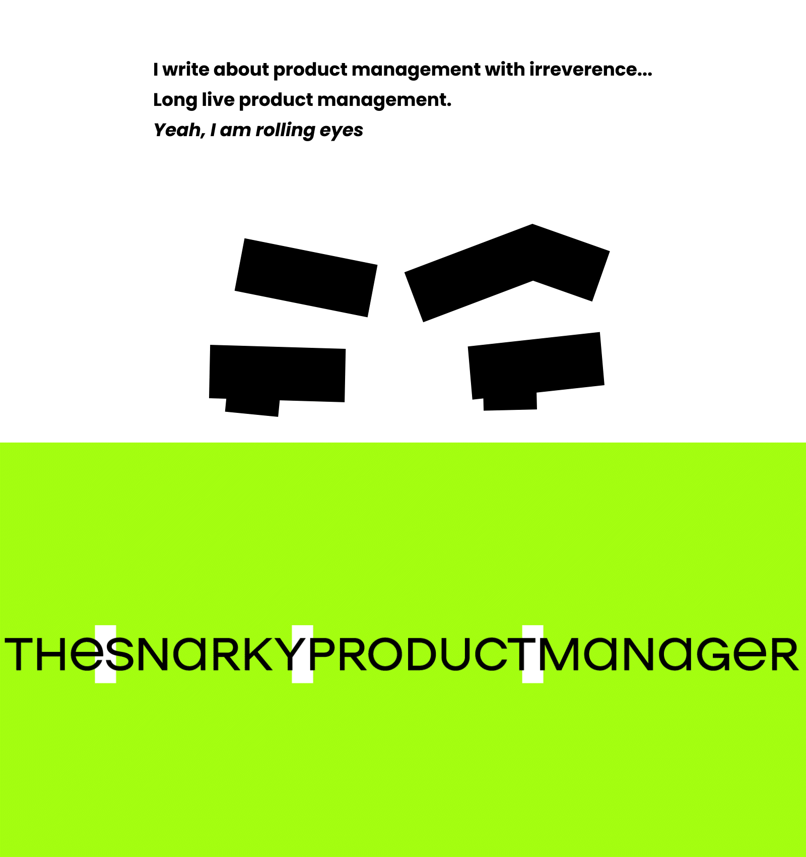
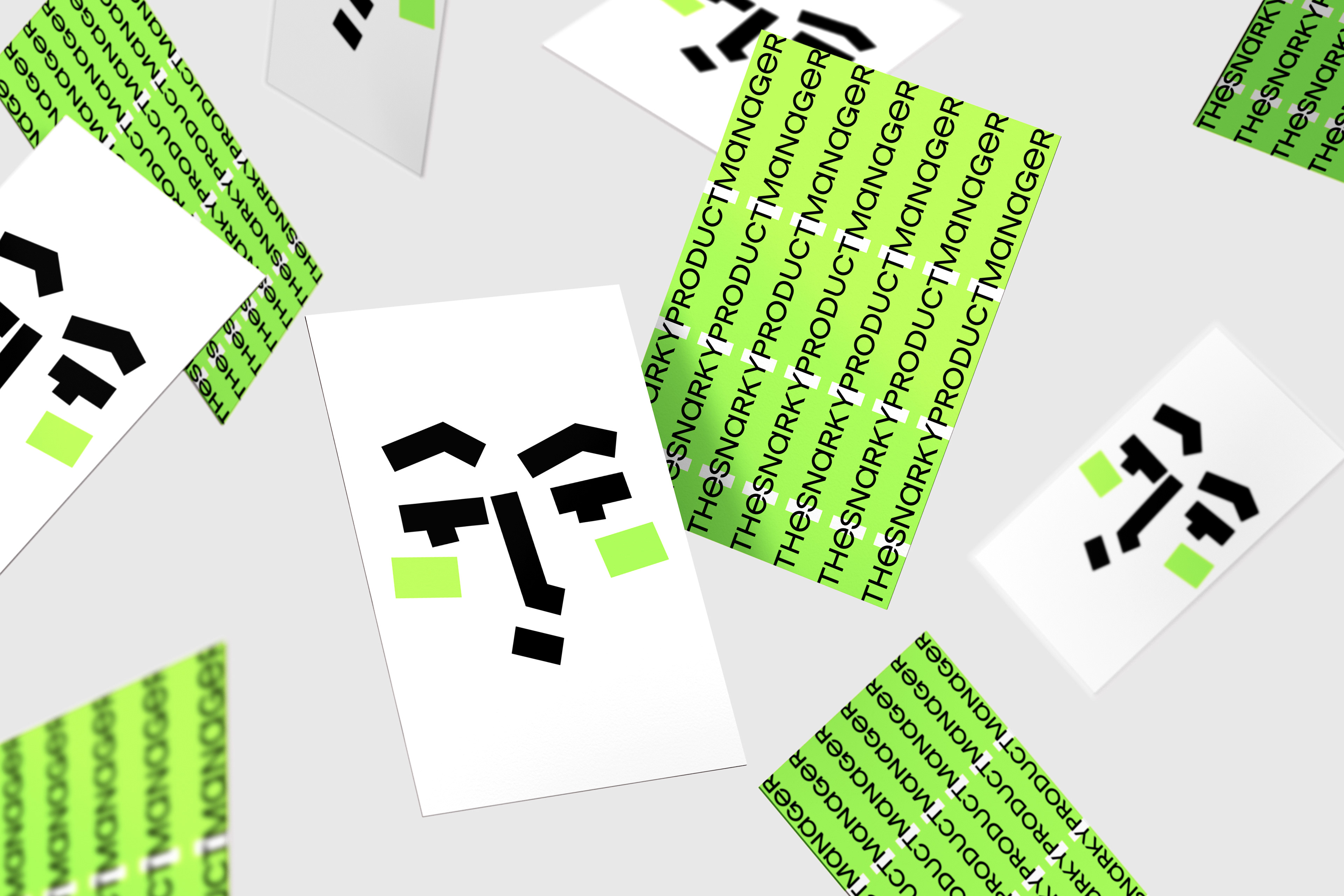
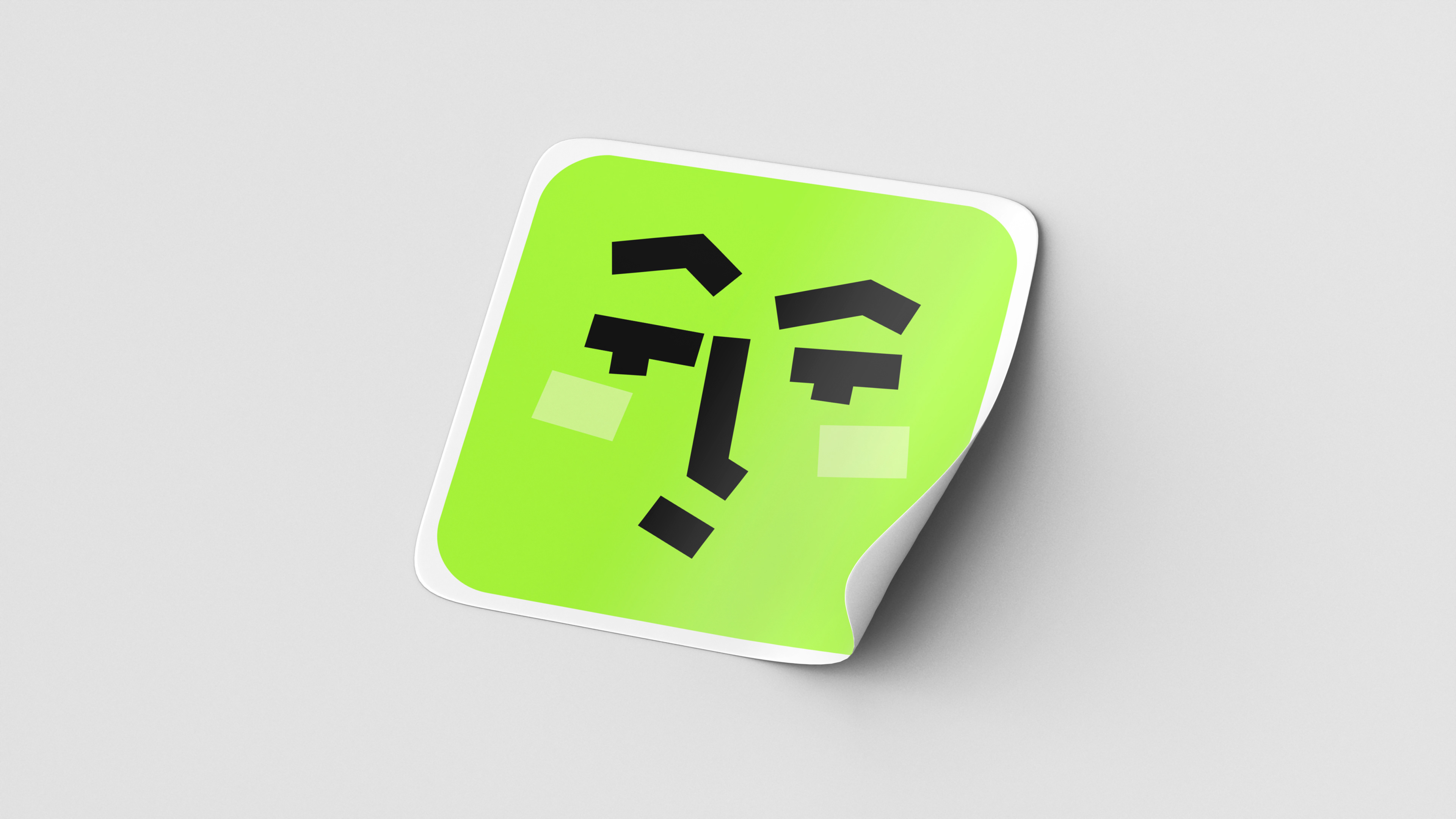
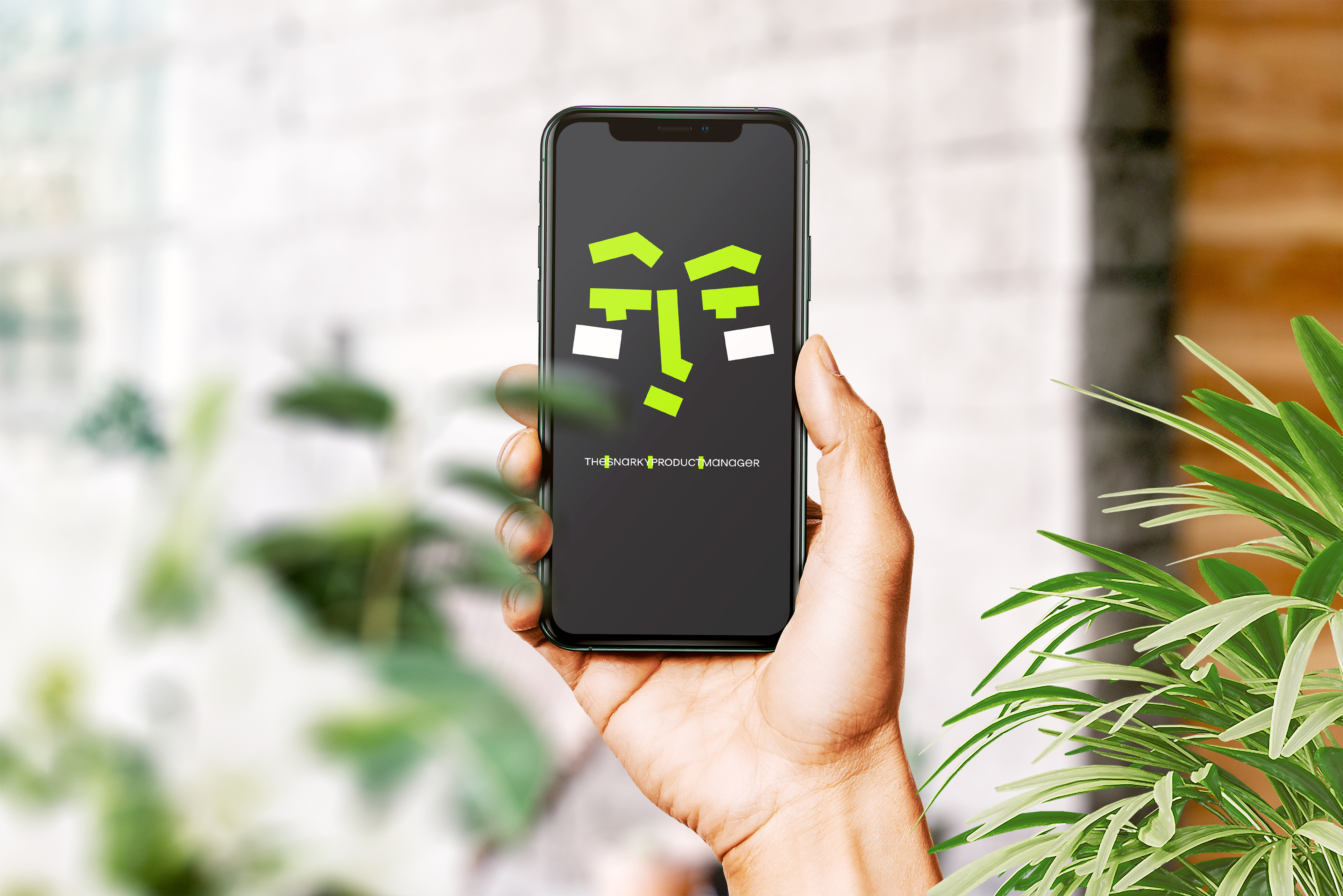
So, the logo. It is an actual face of our snarky persona, stylized graphically.
Wherever possible, it should be used in animated form.

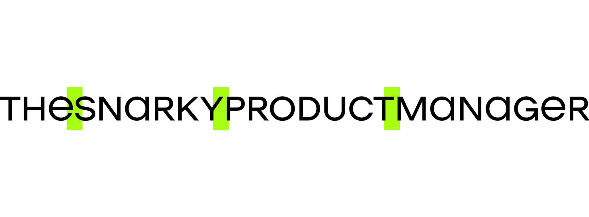
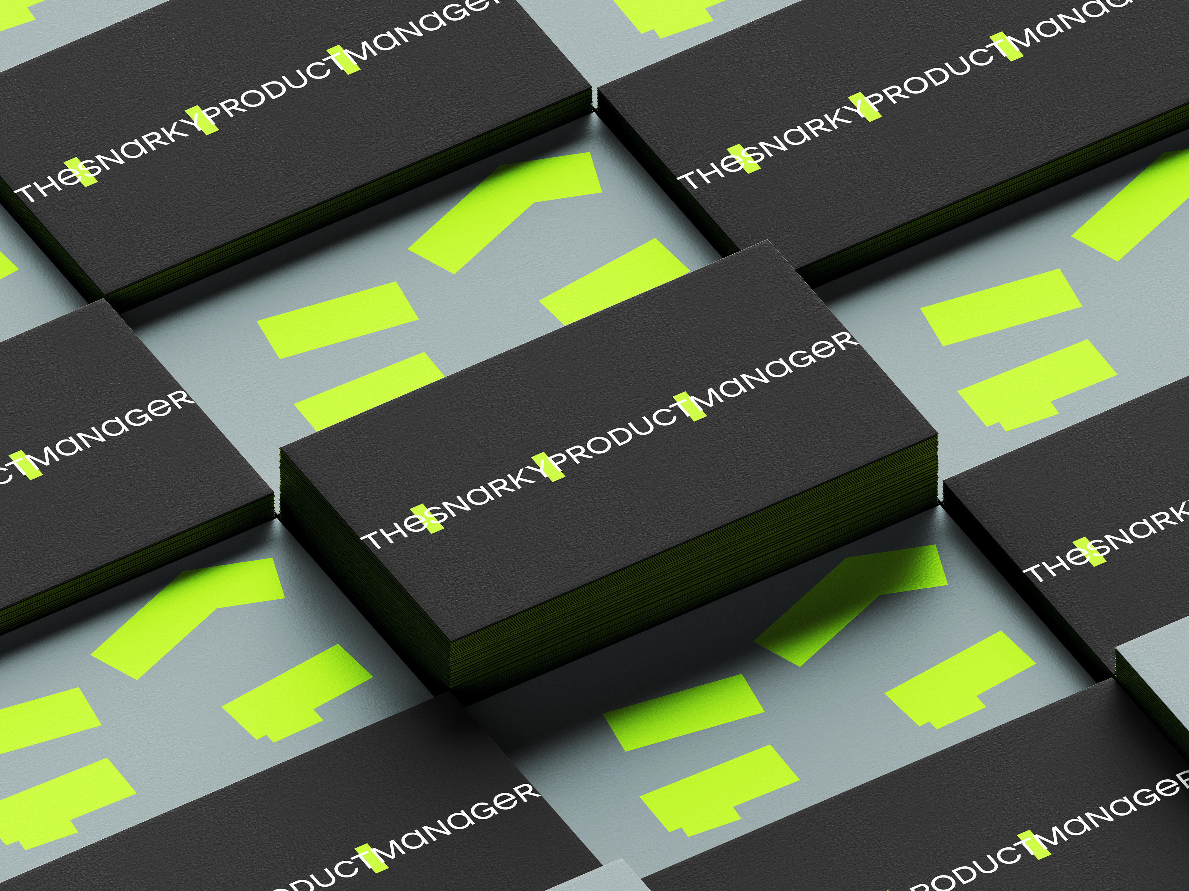
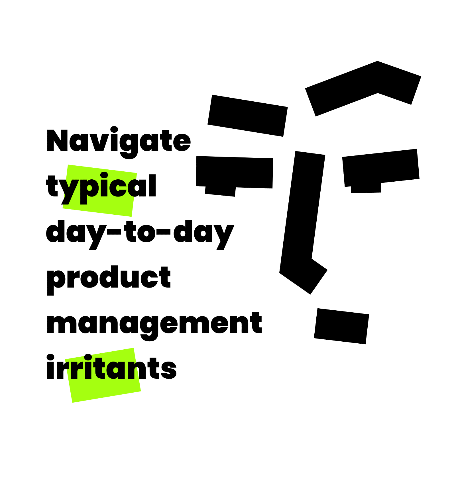
The title is a long undivided name.
I've added graphic separating elements for readability, the same size and style used in the sign.

Thanks, that's a wrap.